
Open to access this content
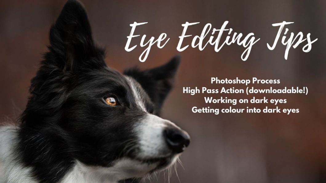
Editing Eyes
Open to access this content

Open to access this content

Open to access this content
Open to access this content

Open to access this content

Open to access this content

Open to access this content

Open to access this content

Open to access this content

Open to access this content