
Open to access this content
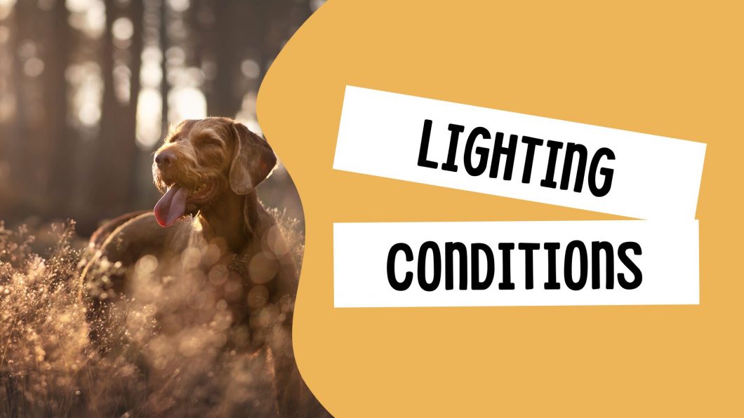
Lighting Conditions
Open to access this content
Open to access this content
Open to access this content

Open to access this content

Open to access this content

Open to access this content
Open to access this content
Open to access this content
Open to access this content
Open to access this content