Open to access this content
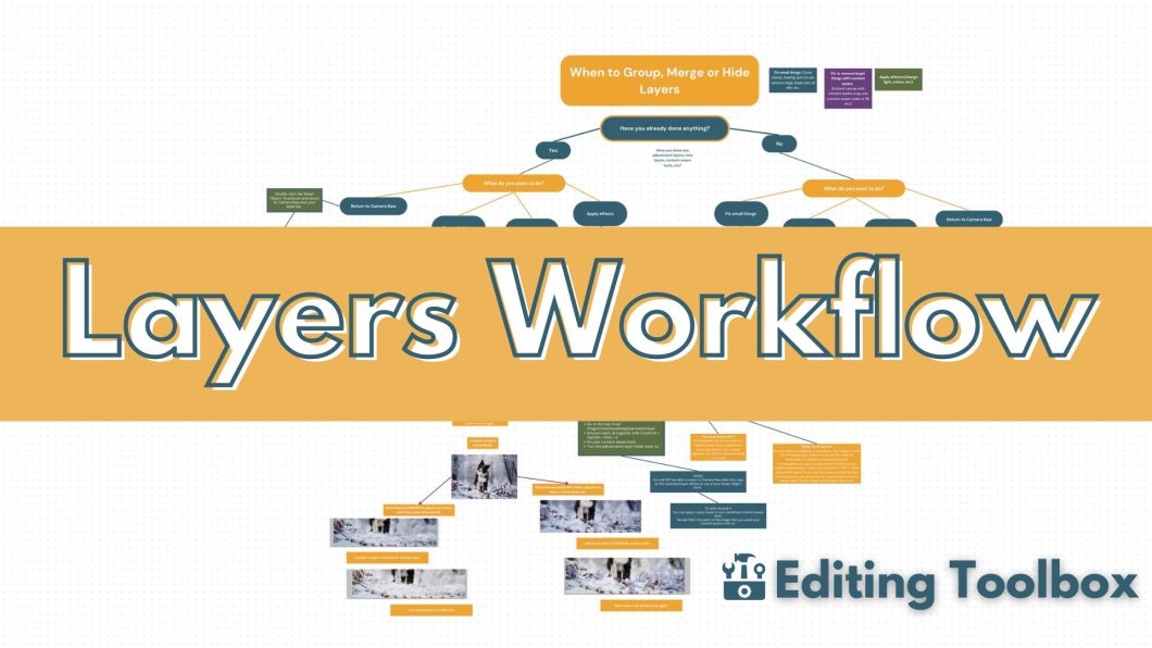
Layers Flowchart
Open to access this content
Open to access this content
Open to access this content

Open to access this content

Open to access this content
Open to access this content

Open to access this content

Open to access this content

Open to access this content

Open to access this content