
Open to access this content
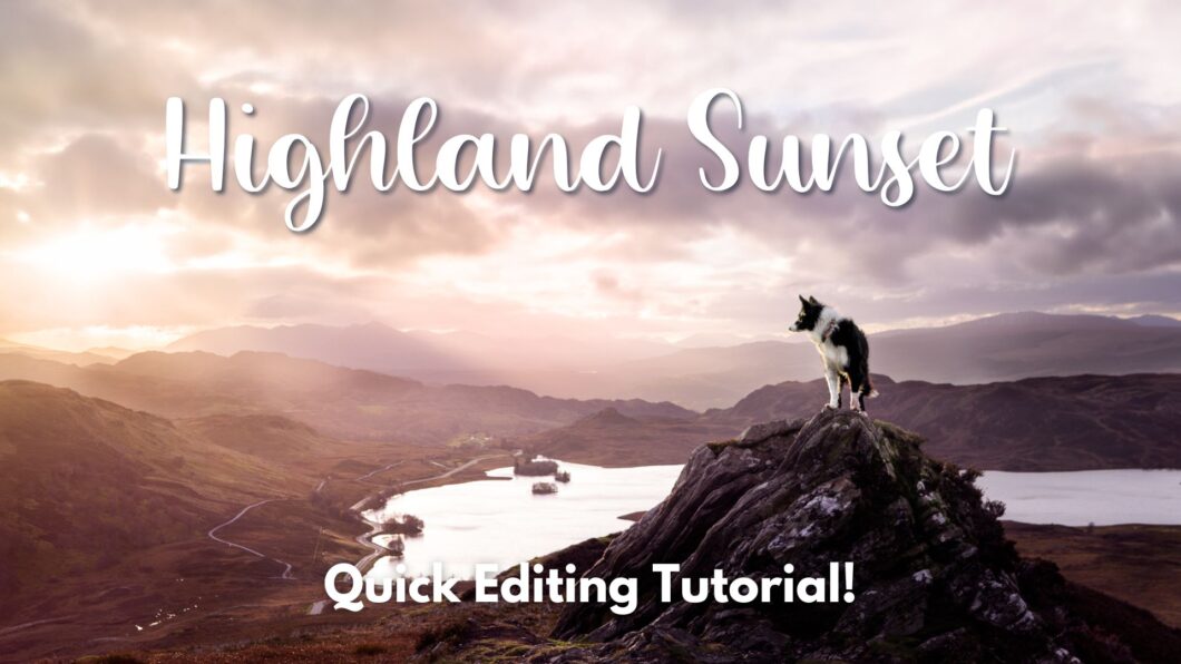
Highland Sunset
Open to access this content

Open to access this content
Open to access this content
Open to access this content
Open to access this content
Open to access this content
Open to access this content
Open to access this content
Open to access this content

Open to access this content