
Open to access this content
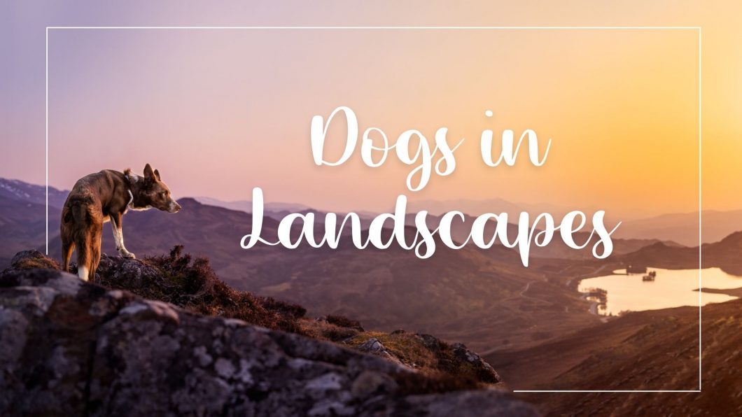
Landscapes
Open to access this content
Open to access this content
Open to access this content
Open to access this content
Open to access this content
Open to access this content
Open to access this content
Open to access this content
Open to access this content
Open to access this content