ArchivesFull Tutorial

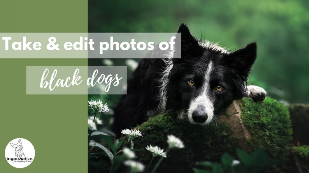
How to: Take & Edit Photos of Black Dogs

Table of Contents

There seems to be this idea in people’s minds that taking photos of black dogs is the holy grail of photography. That they are somehow the most difficult coats to take photos of. In this how-to guide, I’m going to equip you with some tools to go confidently into your next photoshoot with a black dog, and begin to consider that they might actually be easier in some ways than, for example, coloured dogs.

It's All About Light

As with everything in photography, photographing black dogs is all about light. How much, where from, how strong, what temperature and so on. For some reason there seems to be this idea that while a “normal” dog can be photographed on overcast day, somehow the entire light of the entire sky won’t be enough to illuminate a black dog, so people try photographing them in the full sun.

All these dogs are so shiny. And I think the thing that gets me is that all this shine tends to make them look quite grey. People worry about lightening up black dogs cos they’ll turn grey, but then go and take photos of them in these conditions. Anyway.

If you’ve worked your way through ANY of the two non-editing courses (and I hope, if you’re here, that you have) you’ll know that harsh sunlight flatters NOBODY. Especially not black dogs. 

In my opinion, black dogs go insanely shiny in full sun. SO SHINY. Some people really like this shine, but I find it kind of ugly. Maybe you have to make up your own mind here but it’s certainly not my favourite thing. Not to mention all the crazy shadows and tiny catchlights which come from taking photos in the full sun. 

I would even go so far as to say that late afternoon light, when the temperature is warm, can also be problematic to black dogs when it is direct light, as their coats reflect colour so easily.


So much yellow in this coat. And it's technically correct because of the temperature of the light, but also... so yellow. And let's make a note of the side-light and come back to that, shall we?

So now that I’ve completely terrified you away from taking photos of black dogs in any kinds of lighting conditions, what can you do?

As With Every Dog: Get Enough Light

The main thing, is to get soft, even, flattering light on the face. Like with every dog in every photo we’re taking. 

Staying on the edge of the woods, in a clearing, or by a road will make sure plenty of light from the sky falls on the face. Check out the Locations lessons if you’re in the Learning Journey, under Creating > Locations. We want to avoid especially deep shadows, or situations where we need to really under-expose the dog so we don’t risk “clipping the blacks” or even just making the black dog so dark that trying to lighten him results in a lot of noise.

Balancing the Light

As with every dog and every photo we’re aiming to balance the light. This means (in general), highlights not blown out, BUT not underexposing so much that you can’t get detail back in the dog. This will be different for every camera, and varies for ISO. I know a friend’s camera will start to really show a lot of grain and loss of detail if she has to raise the shadows very much at ISO 320. Mine is pretty fine until it’s over ISO 1000. That being said, on photos like the one below, which is ISO 200, Loki is so underexposed that I had to raise the shadows a lot in order to simply SEE him. And this was extremely noisy. 

So there is a balance between how much you can/need to lighten the black dog, the ISO, and what your camera can handle.

Focus Issues & Black Dogs

One problem I’ve heard from members of the LC is that their camera struggles to focus on their black dog, when they have to underexpose the image due to backlight or similar.

We talked about this in the March Q&A.

What we have to remember is that our cameras generally look for areas of contrast, to know where to focus. So when we have a black dog in an underexposed situation, especially if their face, eyes, or lighting situation don’t really give them catchlights in their eyes, we just have a black blob in front of the camera. So it looks around and goes 🤷🏻‍♀️ and focuses somewhere. Because there’s nothing to say: “This is one part of the subject, and this is another part”, it’s just all dark. 

OR… it will find the shiny contrast of the dog’s nose, and focus there.

If this is happening, you have a few options:

  • Make sure you’re using a single-AF point and positioning it over the eye. We need to not really give the camera a lot of options as to where to focus. 
  • Find an area with more light on the dog’s face, or even use a reflector to bounce more light onto the dog’s face. We really need to create some contrast for the camera to find, particularly in the eyes. Try also getting the dog to raise their face slightly, to get more light reflecting from the sky.
  • Underexpose less. Yes, you may need to blow out the highlights. If the choice is between your dog not being in focus, and the highlights being slightly blown out… I know which is more important to me. 
  • If your camera is consistently focusing elsewhere even when there’s plenty of light on the dog, make sure you check out the focus lessons to try and diagnose the problem.

Backgrounds

Be very aware of your backgrounds with black dogs. We need to really help them stand out and be separated from their background, but also not be overwhelmed by their background (yes, it’s a balancing act!).

  • Putting your black dog against a dark tree stump/trunk/dark bush is going to make him blend in, particularly if there are ANY bright areas in the image (eg., bits of open sky or bright bokeh spots)
  • Putting your black dog against a very bright area might contrast him, but also he can get “overwhelmed” by the brightness, especially if it’s busy.

So, where can you put your black dog?

 Solid, mid-toned backgrounds work very well. That means they aren’t too bright, and they aren’t too dark. The editing tutorial of Šaj below is a good example of a “mid-toned” background.

Backlight also works pretty well IF it’s well-filtered and not overpowering. This is because the rim light can help the dog have a lot of separation from the background. They are glowing, we can easily see the shape of them, and this glowing light draws our eyes to them as well.


1. Using backlight & rimlight for a dramatic black dog in dark environment photo. 2. Low-contrast, mid-tone background. 3. An example of when Loki is in a “dark area” and would easily become overwhelmed by the light areas of the photo. 4. Low contrast mid-tone. 5. Mid-toned background. 6. Backlight. 7. Putting him in a dark hole (I could edit this, but getting separation would be difficult still, but I could use it for a dramatic deep/dark forest effect IF he didn’t look so cute.). 8. Getting overwhelmed by light in the background. 9. Low contrast, mid-toned background. Light directly behind to contrast his dark. 10. A kind of “tunnel of light” (soft light) behind him, to contrast his dark fur against. Eye is drawn to the light -> dark dog is in the light. 11. Dark dark dark, but fun as a dramatic effect and certain mood. 12. Backlight to help her stand out. 13. Mid-toned background. 14. Mid-toned background (old photo, I would turn down the bokeh a bit more now). 15. Backlight and monotone colours. 

Balancing Black & Grey

One of the other main issues people run into, is balancing black and grey. It’s very easy, when lightening up a black dog (especially when raising shadows!) to end up with a washed out grey dog!

And it is a balance. Without light, we can’t see the details of the dog. With too much lightening, we have a grey dog. The main thing to remember here, I think, is that our eyes make sense of things based on light AND dark. We can’t tell what is bigger or smaller, in or out, without areas of light and areas of shadow. 

What I’m saying is, don’t be afraid of blacks and shadows. Our dogs are black. Without blacks and shadows, we loose the contrast that TELLS us they’re black. One of the ways I make my black dogs look lighter, is to contour their face with darkness. By adding darkness to the shadow/inward parts of their face, it gives contrast compared to the light parts of their face – essentially, making the light parts look lighter! 

It’s like how if you’re editing a photo, and you have the background of Lightroom or Photoshop set to light grey or white. Your photo then probably seems really dark, right? Try setting the background to black. Now your photo looks really light!! Nothing has changed except the shade around the photo and the contrast for our eyes between the light and the dark. 

These two images are exactly the same. Notice how the one on the black background looks much lighter and has more detail in the surroundings than the white background image? 

So yes, we want to be able to see the details of a black dog. We also want to keep them a nice, rich black. Don’t be afraid of adding some contrast to their fur.

Contrast

One more note on contrast,  is that contrast can help our dog stand out, if there is no contrast in the rest of the image. Our eyes are drawn to contrast, and contrast is particularly visible when compared to areas of low contrast. So, by making sure our dogs are a rich black with plenty of contrast, and removing contrast from their surroundings (by raising the blacks, for example), this will also help them to stand out.

In this image, Loki is contrasted, he has pure black. All the surroundings are shades of grey. There are no other areas of contrast except on him. If the background was as contrasted as he is, he would blend into it much, much more.

Blue Dogs

Another thing to be conscious of is the fact that black dogs reflect colours – particularly blue. Blue dogs is one of the main issues I see with people editing black-coated dogs. 

You can sometimes use the space between the dog’s eyes as a place for the “Eye-Dropper tool” in Lightroom, to tell it that the area should be pure black. But, this is assuming the dog IS pure black. Many dogs have a lot of red/brown undertones in their coat, even if it’s VERY subtle. I’m looking at Loki’s fur in the sun right now (and he is about as black as black gets, apart from the edges of his ears) and there is definitely brown in his coat. Therefore, if I used the eyedropper on his black coat, it would probably shift things too much to blue (cancelling out the yellow) or to green (cancelling out the magenta). 

A better tool is to turn the saturation up to 100 and then adjust the white balance. Because the black coat is made up of brown (magenta/yellow), I will usually shift the white balance slightly to the warmer side of the spectrum as this is more likely to be “pure black”. I don’t worry about small areas of blue at the tip of the snout and between the ears. This is totally normal. 

1. SOOC. 2. Saturation turned up to 100. 3. White balance adjusted. 4. White balance turned all the way up. (And I would say, he’s probably still slightly too cool!)

You can also add a hue/saturation layer in PS and turn the saturation all the way up. This is a MUCH stronger effect than in Lightroom so be careful what you do with it (eg., don’t try and remove ALL the blue/yellow/colour. Remember, our black coats are not pure black!)

So, how can you get to a more “pure black” colour in editing? (Because it’s totally normal and natural and just the way light and colour works that they will end up blue when taking photos of them. Don’t try and fight it, just take the photos in RAW so you have complete control over adjusting the WB later)

  • Correct the white balance (this should solve the majority of problems).
  • (Possibly) lower the blue saturation somewhat in the HSL panel in LR.  Notice how tentative I am about this point? Because I do NOT want you to completely strip the colour from their coat!
  • Use a radial filter to lower saturation from specific points, OR (maybe even better) add yellow to those areas.
  • In Photoshop: Use a hue/saturation layer to lower saturation (be careful)
  • Or, use a colour balance layer to add yellow (and maybe magenta) particularly to “shadows”
  • Or, use a solid colour adjustment layer in yellow (the opposite of blue). Set the blend mode to “colour” or “hue”, and paint it over the blue areas. Lower the opacity, like a lot. 
  • If you are STILL having a lot of issues with blue, I would suggest your white balance is way too cool. 

Editing Lego – Full Edit, Without Commentary

This video is normal speed, of me editing the image above of Lego, for an #inspawrationedits feature. I didn’t make a full “lesson” out of it, because I just wanted to work, but you might still find the process interesting. It follows my normal workflow without anything too different from normal.

Marie Rozwalak – the photographer, has been kind enough to allow you to edit the original file! Make sure that if you do, that you make it clear that she is the photographer (@about.lego on instagram). Might even be worth checking with her first that it’s ok. A bit of courtesy never hurts anyone.

How to: Create a “Deep Dark Forest” photo (old version)

Table of Contents

Focus: Creating a mood or a “style” of photo. Elements which go into creating a mood. Finding a location. The photoshoot. Editing.

Program: Any, though I discuss LR & PS here

Difficulty: All although obviously the end results for a newbie will look different to someone with more editing knowledge! Newbies can definitely still get out there and give this a go!

Recommended prior knowledge: changing camera settings

The Deep Dark Forest

One of my “signature” photo styles is the “deep dark forest”-type of photo. This tutorial is going to go through both how to set up this shot in-camera, and which elements you may wish to consider in editing.

Behind the Lens

I cannot emphasis enough, that there is much more to creating this look (or style, if you will), than just turning everything dark and green. There are a number of elements at play here and they will determine how well the “mood” of the photo will work and very few of those elements are editing choices.

Have a look at the photos above, and any others you consider to be “deep dark forest”. How many stylistic choices can you name? I’m not just talking about editing choices, but everything from light, to location, elements of visual interest, the pose, the expression, and so on. When you’ve had a think and made your list, scroll down!

Deep Dark Elements

As I was putting this tutorial together, it forced me to really analyse what I had been putting unconsciously into this kind of photo as I was creating them. Some of the below are very much linked to my own style – you may decide you don’t want so many “things” in the scene (eg., ferns, or moss, or vines etc) and want a cleaner, simpler scene. Don’t take this advice as gospel, or a MUST DO list. But a guide of things you might want to consider. 

So, here we go, essential elements that I believe help to create the feeling of a “deep dark forest” photo.

  • Light
    • Despite how it looks, all these photos were taken with the dog in some kind of well-lit situation, either on the edge of the trees, or in a clearing of some kind. There was always a good amount of light on their faces, and the photo was correctly exposed (for highlights).
    • Not too much of it though! Photos with a lot of obvious light (eg., taken in dappled shade, in full sun, or even with backlight) won’t really have the “‘deep dark” mood
    • These photos work best on overcast days, without large gaps between the trees in the background
  • Location
    • Using elements of nature to position the dog in the scene, particularly moss and ferns, or fir/pine/evergreen-type trees
    • I feel like there needs to be a closeness/tightness/intimacy between the dog and the “nature” for this to work really well. To be amongst it, or on it, that he is a part of it and amongst it
    • Use of foreground/midground/background elements or layers
  • Pose and expression
    • Poses work best with some kind of intensity, though not always (Journey with his tail hanging down is quite a relaxed pose, but his gaze is at the camera), OR more of a “whimsical” vibe. If we consider that a feature of the DDF photos is the idea of the dog being amongst nature, in some ways the poses should look “natural”. A dog sitting square facing the camera looks like he’s been plonked there. A dog “relaxing” on a log is still unnatural of course, but doesn’t have the same feeling.
    • Expressions are serious. For a dark mood, we need a serious expression. 
    • There is a possibility for a more “whimsical” expression (such as the last 2 photos) which creates somewhat more of a fairytale mood.
    • Consider the personality/breed/age of the dog too. A golden retriever puppy who is perpetually happy may struggle to fit in this look, same as a fluffy white princess diva dog. 
  • Colour
    • Obviously, lots of deep, rich greens. This was usually already in-camera, as the photos were taken throughout spring and summer. 
    • I don’t tend to try and “fight” photos to give me different colours than the tones which are naturally (albeit subtly) already present. I don’t recommend trying to turn your rich autumn browns to green just for the hell of it. Wait a few months for the greens to be back. 
    • Usually monotone (black & white with green) or contrasting colours (red dog & green). Again, a golden retriever may not suit this kind of photo as the yellow/cream coat doesn’t “fit” with the greens. This isn’t to dissuade you from trying, But if it doesn’t “feel” right while you’re editing, it may be that the colours clash. Orange dogs should work (shift the green more toward cyan), liver brown should work in much the same way as red. “Blue” dogs will work if they become pure grey. 

How to Take The Photo

  1. Find your location as per the above considerations. Is there enough but not too much light? Is there some visual interest? Is the background “closed” or mostly closed? (eg., no big open spaces between trees). Tidy up the spot a bit. Make sure it isn’t too full of distractions.
  2. Position the dog amongst the scene, connected in some way to the natural elements. His face should point toward the light-source (sky). Consider his pose and how this may alter the story or scene you’re creating.
  3. Find a good angle for the photo getting down low (unless they are on an object or you’re doing a head/shoulders shot, in which case, getting down low enough), with a bit of a foreground layer, with no trees growing out of his head, no huge areas of sky behind. Consider the shape/curve of the elements in the location and how they may lead toward our dog, or away from our dog. 
  4. Consider your composition. Is he looking straight ahead, or to the side? Is he tall or short in the frame? Are there dark elements in the background if he looks one way? Would it be better to get him looking the other way? Are there tree trunks or objects blocking his view if he’s looking to the side? Do you have any natural frames, curves, or leading lines that you can use?
  5. Set your exposure for highlights. This may be light in the background, or the white part of the dog, or the dog himself, depending on the scene and your dog. 
  6. Take a burst of photos. Try another expression or looking direction. Change your angle. Change his pose. Check your photos before you leave. Is the mood of the photo already the mood you want to create? Editing aside, deep greens aside, is there something dark and intense about the photo? Or enchanted and whimsical? Is the background and the scene helping create a sense of mystery?

The Editing

As with all editing, there is no “recipe” for how to create this look, but there are some things you may wish to try, and some things to use to guide you.

  1. Work on the distractions in Lightroom. Set the white balance, find distractions, fix them. If you’re not sure what I’m talking about, check out this workshop.
  2. Once the image is fairly “neutral” and “balanced”, open it in Photoshop. I open as a Smart Object.
  3. Darken the image around the dog. Consider where you want there to be an appearance of light falling – where would naturally be lit, and where would naturally be shadowed? If part of your dog needs to be shadowed, then darken it too! Don’t have a glowing bright dog in a dark forest, it doesn’t make sense. Create the sense of light, and therefore the sense of shadow. Shape the appearance of light falling on the dog’s face (as it should have been!).
  4. Darken it as much as you feel comfortable and before you begin to loose details in the blacks. Try pulling up the tone curve at the blacks end, so the blacks don’t get completely black. 
  5. Use one or two selective colour layers working on yellows. Raise cyan. Depending on its effect, you may also wish to try: lowering magenta (will make everything look fake very quickly so BE CAREFUL). Lowering yellows makes the green into a more green/grey – be careful, can look fake. Raising yellows can make the colours richer. Don’t worry if the saturation is out of control, you are looking for the right TONE here. We’ll fix saturation in a minute.
    1. Remember – greens DO have yellow tones. Making your greens “too green” can make them feel fake. Err on the side of “slightly more yellow than you think you actually want” and you’ll probably be about right. But then again, it’s all personal preference. I just know people can end up with some weird plastic-Ikea-tree-cyan-greens at this point. 
  6. Lower saturation as much as needed to strip out some of the colour and make the image more moody. Less colour = more moody. 
  7. Check for distractions. Are there bright areas that are drawing attention? Bright elements tend to clash with this dark mood so make sure they are moderate and not overly bright. 

Editing Tutorial

Here is an editing tutorial, working on the photo below. Remember, you might’t need to follow my exact steps – you may want 2 curves layers instead of 1. You might need to do more or less work on the greens, etc. It all depends on the photo you’re working with. Similarly, you can use many of these techniques to create other “deep dark” effects. It’s all about curves layers, darkening, and remembering where the light would naturally be hitting – even if there isn’t very much of it. 

In the tutorial below, I actually couldn’t “shape” the light as much as I sometimes might, because there was no real shaded side of Loki. Just remember that if the light wouldn’t be hitting a part of your dog, because it’s amongst the ferns, or emerging from some trees, or it’s just his face surrounded by ferns, it doesn’t make sense for those areas that should be in shadow to be bright.

Before
After

You can have a go at editing this photo too! The .TIF file acts like a raw file, but if for some reason you can’t edit .TIF files, there is also the high-res .jpeg file.

A Video Guide to Taking & Editing Snow Photos

In the video, I discuss some difficulties we may have in terms of taking and editing snow photos, then go through a full tutorial, trying out some new techniques (please don’t worry about the “channels” thing just yet. I’ll explain it further when I figure out how it’ll be useful for us!), do some colour changes and so on. 

There are some parts where I skip ahead in terms of masking things in or out. You will probably be able to follow this tutorial pretty well if you are at an intermediate level (or advanced). At the end, I break down how I constructed one of my favourite snow images of Journey. 

Remember as well the free blog post which has some more snow tips!

Any questions or comments, please let me know below, or in the group, and remember to use the #inspawrationcommunity on Instagram!

The Main Points

  • Snow photos do not usually give us much opportunity for a foreground (or mid-ground) so we need to look for other interesting things in the scene, like “tunnels” of light in the background
  • We can’t go overboard doing crazy editing with snow photos (usually) because we don’t have as much to work with in the foreground/midground and a lot of darkening or vignetting will be obvious and unnatural. 
  • We can shift the colours slightly to blue, but need to make our own stylistic choices as to HOW blue we make it (I prefer to err on the side of “still more or less realistic” but you might want to make it more fantastical).
  • Eyes can get weird with the snow reflection. Try a bit of “dehaze” to take it away a bit.

Editing Livestream: Misty Grey Bobbin (GSP)

This livestream was a special event to thank the first sign-ups to the Learning Community (and to test some of the technology – which didn’t work) and to start settling in to our work.

Unfortunately I missed recording the first part of the chat, where we tried unsuccessfully to decide which image to edit, and I also set the white balance. But other than that, I think everything is included here.

Next time I’ll actually read out the questions from the chat so I’m not just replying to the question – but the chat transcript is below, so you can see the questions people asked, and I also wrote the keyboard shortcuts people were asking about there too. 

Also, you can download the .tif file or a high-res jpeg file here (they’ll open in a new window).


I’ve made it a .tif file as older versions of Lightroom (or other programs?) might not be able to open the .RAW file since my camera is reasonably new – I know I had trouble as I was using a super old version of LR when I first got it. The .tif files should operate pretty much exactly as a RAW file.

And! You can upload your finished edit to the Facebook group album: “Edits Together” so we can see how you went! You don’t have to edit it like mine either – take it in whatever direction you like! 😊

Chat transcript:

19:27:12 From Romy Van Hemert : it also was me 😂 I hadn’t turn my audio on yet. I can here you now
19:34:13 From Emily Abrahams : \\\\\\\
19:34:42 From Sandra B : how do i see befor and after?
19:35:16 From Sandra B : when im editing 😀
19:35:18 From Romy Van Hemert : sorry! i am at work and secretly watching👀
19:36:47 From Emily Abrahams : \
19:37:16 From Océanne Martel : Same I missed it too!
19:39:00 From mattb : My dog has to be on lead so I always have to remove collar and lead when would you remove it?
19:40:21 From angelakamper : When will you crop? In the begin?
19:40:39 From mattb : Perfect thank you
19:48:55 From Rosie : Keyboard shortcut to show the overlay mask on photoshop?
19:49:05 From Emily Abrahams : \
19:49:09 From Mirella : And the shortcut for bush size?
19:49:14 From Emily Abrahams : []
19:49:48 From Emily Abrahams : [ ]
19:50:02 From Mirella : I have those behind cmd/alt + () combination
19:54:42 From angelakamper : My oval is very hard on the edge?
19:55:05 From angelakamper : thanks
19:57:05 From Mirella : I have the smallest Wacoom that’s been serving me for like, idk, +5 years at least 😀
20:05:50 From mattb : would you sharpen as the last step?
20:06:34 From mattb : What camera are you using?
20:12:44 From Felicia : What was the keyboard shortcut for making new radial filter in LR?
20:14:20 From Sandra B : YEEEEES!!!!!!
20:14:25 From Océanne Martel : Yes I would love that!
20:14:33 From Felicia : Yes
20:14:35 From Mirella : It would be hard to listen, focus and do at the same time 😀
20:14:42 From Mirella : I’m gonna stick with watching & taking notes
20:15:27 From angelakamper : Yes love that idea
20:15:31 From Rosie : Or we can rewatch the video after and edit along.
20:15:33 From Romy Van Hemert : yass I that would be lovely. like a real class
20:16:03 From Océanne Martel : yessss
20:16:11 From Romy Van Hemert : yess I would want to practis on that photo also
20:17:47 From Romy Van Hemert : awesome!
20:18:27 From Sandra B : how do i reverse white frame to a black? Dont remember the name
20:18:48 From Sandra B : windows
20:18:51 From Emily Abrahams : Cmd +I or ctrl + i
20:28:30 From Mirella : You explained everything very well on the way!
20:28:34 From Océanne Martel : No not for now! 🙂
20:28:34 From Mirella : No questions left
20:28:40 From Rosie : Nope thanks!
20:28:53 From Sandra B : Why are all my notes om Swenglish 😛 haha.
20:29:05 From mattb : Perfect thanks, awesome work…
20:29:16 From angelakamper : Wil jou share also the edit version? So we can see the colors? Because zoom has flatting
20:29:42 From angelakamper : thanks
20:29:52 From mattb : Is it ok to post and ask for critique?
20:30:52 From Romy Van Hemert : awesome work em! love your vision and ideas. thankyou!
20:31:42 From Océanne Martel : Love your ideas!
20:31:45 From mattb : I also have a Canon 1d mkII body that I would happily give to someone if it would help them out – perhaps your scholarship
20:31:49 From Felicia : That would be awesome!
20:34:13 From mattb : No problem
20:34:27 From Rosie : Thank you! Have a great evening!
20:34:31 From Romy Van Hemert : have a nice night! thankyou
20:34:32 From Mirella : Thank you em!
20:34:34 From angelakamper : Have nice evening and thanks, great edit
20:34:36 From mattb : Great session thank you
20:34:36 From Sandra B : Thank you!!
20:34:40 From Océanne Martel : 😂 Honestly I have so much to learn from you and I think it’s worth it, you’re amazing and I still have a lot to learn! 🙂 thank you good night!

You can edit this photo however suits you – either follow along, pausing the video as you go, or put your own spin on it! As you’ll see, the colours on the video are VERY desaturated so don’t worry if it looks different to yours!

Journey in the Woods: Full Tutorial

This is a full editing tutorial, from RAW file to finished product, going through my entire workflow (more or less). There’s nothing too fancy, making this a great tutorial for someone who is familiar with both Lightroom and Photoshop, but it probably doesn’t suit a complete beginner. I do mention the keyboard shortcuts I use, and really try and describe most of the process, so this could be a good one if you’re still gaining confidence in PS.

You can also download the .tif file (which works the same as a RAW file, more or less) to follow along!

Program: Lightroom & Photoshop

Difficulty: Medium

Recommended prior knowledge: radial filters, adjustment layers, masking

My aim with this image was to turn a fairly plain image into a powerful portrait, by minimizing distractions, brightening Journey, and then shaping the light (or the impression of light) to further draw our viewer’s eye to our subject. This is a fairly simple version of my normal workflow, when there’s nothing particularly difficult or “interesting” to fix up, change, or work on except for a few bright ferns.

Note: this is quite an old edit now! My techniques have changed and evolved, though still follow many of the same processes.


While following along with an edit is super fun, make sure you think about what you’re doing and why. The aim of Inspawration isn’t to churn out carbon copies of my style and technique, but to equip you all with the skills and knowledge to find your own style. So don’t feel like your image needs to be exactly the same as the finished product!

Another Backlit Journey: Full Tutorial

Note: This is a SUPER old tutorial so take it with a grain of salt!!

In this full editing tutorial, we take a relatively under-exposed image of Journey in the woods and do quite some work on it – brightening Journey, lots of correcting the white balance, fishing the blown-out highlights in the background in several ways, fixing and removing a lot of distractions, as well as many of my other normal workflow steps.

It’s not necessarily my favourite image, but I chose it as it was a new one that I hadn’t edited before, so what you see here is my actual process, not rehearsed, not scripted – just working with the image and fixing problems as I find them. It’s mainly the fern covering Journey’s body that bothers me, and we do some work in the tutorial to remove part of it, but in the end it’s still too detailed and distracting for my taste, but I think there’s a lot of good information in the tutorial so I wanted to share it with you all anyway. 

You can also download the .TIF file of the before image to follow along at home if you want! 

Before

After

Remember to do some “gardening” during the photoshoot, and ask yourself if the details of the plants are going to be too much – so you don’t end up in a situation with a potentially good image, but with too many distractions!