ArchivesPhotoshop Course

Motion Blur

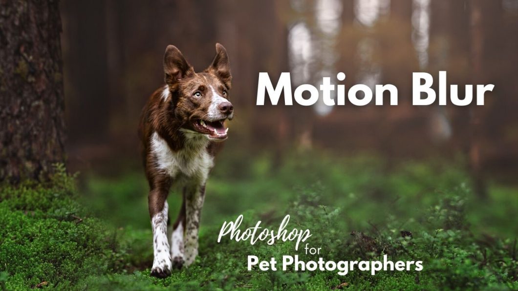
Using motion blur on your bokeh/light spots can create a really interesting effect. This is one I use somewhat often, depending on the size, amount, and spread of the bokeh.

In general, I find this works best if you have bokeh that:

  • runs in lines, eg., between straight tree trunks, rather than in large clumps
  • isn’t overly blown out
  • is reasonably separated (eg., not large clumps of spots).

As with all these techniques, use with moderation. I find that most people, after they have learnt this technique, tend to go a bit overboard and suddenly have super stripey forests. 

Personally, I prefer a more natural look to my forests, rather than these stripy lines… instead, I prefer to make my bokeh shimmer and melt. It makes them feel a bit more dreamy, without being overly fake.

But you can, of course, find your own way of working. Just remember what your intention is with your photo. I find the stripy backgrounds rather distracting, and I don’t tend to pay much attention to the subject. In my photos, I don’t want my audience to be distracted, or they’re likely to leave your photo.

Always ask yourself: is this edit going to help, or hinder my photo?

Some examples of where I’ve used this effect.

We have two ways we can apply Motion blur to our image, depending on what we’ve done to the image beforehand.

If we’ve done some copy/flip, Content Aware or similar we can either:

  • simply apply it to a non-smart object image layer, like our smooshed layer that we’ve been using in earlier lessons (note: duplicate your smooshed layer first!!). We can then mask it in.
    • The problem with this is that we can’t change the amount of blur, or remove it from the image. It’s applied to the pixels. As soon as we save and close Photoshop, or go further down the editing path, we will struggle to undo that effect if we change our minds. It is inflexible editing.
  • The other option is to make a duplicate of your smooshed layer, click Filter > Convert for Smart Filters. This will make it a Smart Object of sorts.
    • Now, when we apply the motion blur filter to the layer, it is applied as a Smart Filter which means we can turn it off, edit it, make it stronger or weaker, etc. It is flexible editing.

If you do not have other image layers/a smooshed layer & are still working with your original:

  • make a new version of your smart object (Duplicate will work here, as if we go into Camera Raw Filter we want any changes to apply to the gaussian blur layer too)
  • go to Filters> Motion Blur
  • Choose how much you want it to blur, then click Apply
  • Mask it in where you want it. Personally, I very gently brush it in on the bottom of the bokeh spots, and maybe slightly on the top.

Since you’re working on a Smart Object layer already, it will be applied as a Smart Filter, so the effect will be editable at any point. 

Gaussian Blur

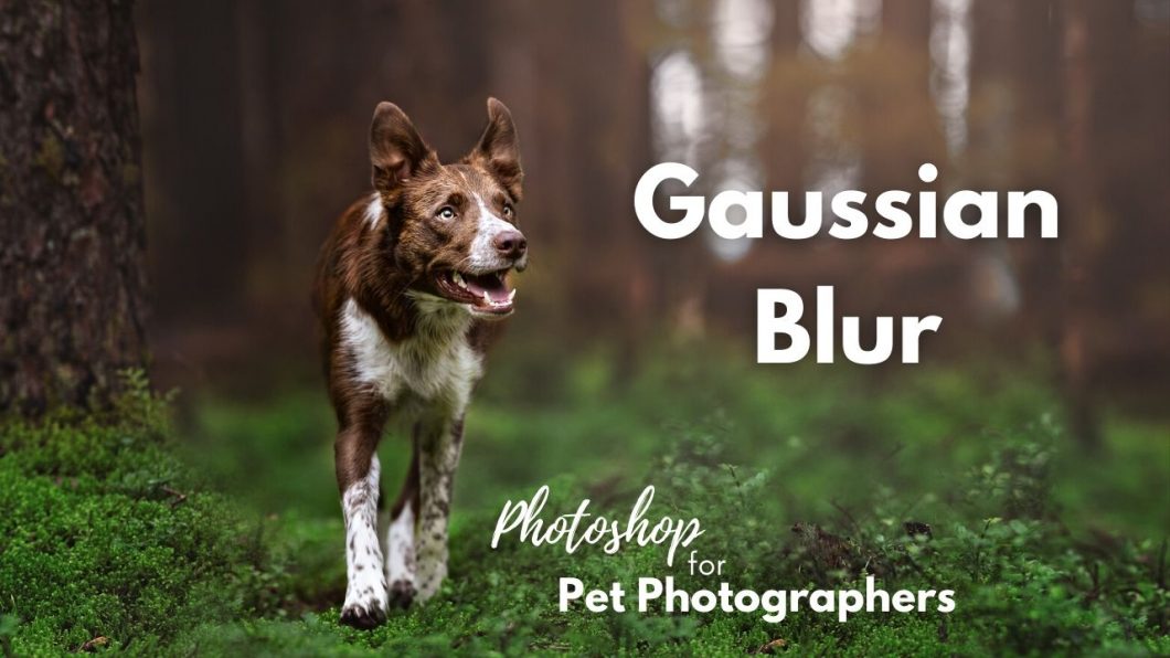
Gaussian blur is a filter we can apply to our image to soften or blur it, as much or as little as we want.

The temptation can be to apply a lot of this kind of blur, however be very careful, as it does not follow the rules of depth of field and can look extremely unnatural. 

We have two ways we can apply Gaussian blur to our image, depending on what we’ve done to the image beforehand.

If we’ve done some copy/flip, Content Aware or similar we can either:

  • simply apply it to a non-smart object image layer, like our smooshed layer that we’ve been using in earlier lessons (note: duplicate your smooshed layer first!!). We can then mask it in.
    • The problem with this is that we can’t change the amount of blur, or remove it from the image. It’s applied to the pixels. As soon as we save and close Photoshop, or go further down the editing path, we will struggle to undo that effect if we change our minds. It is inflexible editing.
  • The other option is to make a duplicate of your smooshed layer, click Filter > Convert for Smart Filters. This will make it a Smart Object of sorts.
    • Now, when we apply the Gaussian blur filter to the layer, it is applied as a Smart Filter which means we can turn it off, edit it, make it stronger or weaker, etc. It is flexible editing.

If you do not have other image layers/a smooshed layer & are still working with your original:

  • make a new version of your smart object (Duplicate will work here, as if we go into Camera Raw Filter we want any changes to apply to the gaussian blur layer too)
  • go to Filters> Gaussian blur
  • Apply the blur.

Since you’re working on a Smart Object layer already, it will be applied as a Smart Filter, so the effect will be editable at any point. 

Professor Snoot's Tips

Using Gaussian blur will remove all the noise from that part of the image.

Hooray! Right?

Well… not necessarily. Depending on how much noise the rest of your original image has, your blurred area might stick out like a sore thumb, as it’s now unnaturally smooth and perfect.

To counter this, and to make sure your blurred area still fits the rest of your photo and looks natural, you might want to add some noise (I highly recommend it!). 

To do this, go back to Filter > Noise > Add Noise. You’ll probably only need between 1-3%, depending on how noisy your original image is.

Solid Colour Layer

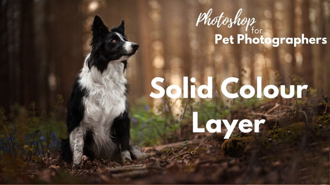
Solid colour layers are deceptively simple, and can be a really flexible and useful tool!

In essence, it is just a solid layer of colour.

Its true strength lies both in choosing blend modes to alter how the layer is used/how it appears, and in altering the opacity to tone down the effect.

We’ll be learning more about blend modes in this lesson, but there’s only a couple I use in regards to solid colour layers.

The ways you can use a solid colour layer is really up to what you need to achieve (as always), and you can get really creative with this tool if you want, or keep it simple.

This is how I tend to use them.

Desaturate Yellow Chests

Sometimes the hue/saturation tool to desaturate just doesn’t work, or it turns the fur grey.

Try using a solid colour layer of the opposite colour (eg., blue when desaturating yellow). Change the blend mode to hue. The hue blend mode keeps the luminosity (lightness) and saturation (strength of colour) from the image beneath (including all your adjustments to that point), but just changes the hue.

This means in terms of a yellow chest, the blue will show stronger where there is more saturated yellow, less or not at all where there is no colour (eg., a black dog or area that is already quite white). This means that you don’t end up with areas of grey from adding blue where you didn’t need to.  It also doesn’t change the luminosity of the area so won’t make it darker or greyer.


Change the Colour of "Stubborn" Things in the Image

This is one of my favourite ways to use this tool.

Sometimes, you’re working on an image, and no matter how much selective colour you do, there’s a patch of colour that just won’t blend in with the rest of the image. This is a quick and easy way to match its colour up with the rest of the background/leaves/foreground/whatever. 

Let’s say you want the stump in the image above to be the same red/brown as the foreground, but it’s just being difficult.

The colour blend mode works similarly to the hue blend mode, but keeps the saturation of the blend (solid colour) layer as well as the colour.

So if you choose a really strong, saturated colour here, you will get a really strong, saturated colour. What won’t change is how light or dark the colour is – the luminosity stays the same. 

If you have an area of blown out highlights that are completely white, adding colour with the colour blend mode won’t help, as the luminosity of the white will stay white. 

Using a solid colour layer like this is a great way to fix little bits and pieces. If you use it too much (eg., to recolour a whole background) it can look very strange, as everything suddenly has the EXACT same colour, and exact same saturation, and in nature, there are varying hues and varying degrees of saturation. Nature is never one singular colour.

There are possibly times in more controlled environments where you may need one specific hue across the whole background – in that case, this would be a great tool for you!

Add brightness/colour to eyes

Another time that you could use this tool that I forgot to mention on the video, is to add the appearance of brightness/colour to eyes. 

Often eyes appear very dark because they’re just black – they don’t have any colour. 

You can make a solid colour layer, set the colour to a rich chocolate brown, change the blend mode to colour, mask it in and turn down the opacity.

Remember, this won’t change the luminosity! So making the colour lighter won’t help! But sometimes all an eye needs is just a bit more “pigment” or colour, so it doesn’t look quite like a black hole.

Remember not to go over the pupil. That should be black!

Colour Balance

The colour balance adjustment layer is a relatively simple tool for adding tones of colour to your image, rather than altering the colours themselves.

It works similarly to a White Balance adjustment, however instead of adjusting the white balance of the whole image, it works by adjusting the C-M-Y spectrum based on a selected light tone, for examples, affecting just shadows, midtones, or highlights.

This allows us to, for example, just make the highlights of an image warmer.

Or cool down the shadows.

Of course, you could just make adjustments to the midtones and use this tool as creatively as you want, to pretty quickly and easily get pink, purple and blue tones across your photo (it is generally a quicker tool to achieve these “fantasy” colours compared to the selective colour tool).

Or, you can use it to fix colour-casts on small areas, eg., if you notice there is a green colour cast, add magenta (the opposite of green) to cancel it out.

You can use it if you think you didn’t quite get the WB correct at the early stages and if you don’t want to (or can’t) make changes to your RAW file via the Camera Raw Filter. 

One thing I’ve found is that when adding yellow, the image will take on a green tone. I tend to add 1/2 as much magenta for whatever value of yellow I add.

Eg., if I add -20 yellow, I will also add approx -10 Magenta. 

As always you can mask this effect in or out, as you decide what you want to affect.

Adding some yellow and magenta to midtones or shadows can be a good way to make very dark/black eyes have more brightness and colour! Just remember to try and keep it natural, don’t go overboard!

Hue/Saturation

Hue/Saturation is a useful tool for a number of applications, including:

  • Removing saturation to tone down colours
  • Adding saturation to make stronger colours, or to make it easier to do selective colour adjustments by having more colour pixels
  • Removing colour casts particularly from black/white fur
    • check chests, chins, legs, the side of the face, and anywhere that colour can be “bouncing”. Just remember that it wouldn’t make sense to desaturate colour casts from a coloured dog (turning them grey) so you’ll need other tools for them!
  • Slightly altering the hue of part of an area
  •  By using “colorize” we can change the colour of the entire image, and mask this in where we need it, turning down the opacity as needed.
  • Remove distractions when colours are too strong in an area.

When & Why Might You Change Colours

Before we jump into the how of changing colours, let’s look briefly at the why.

You may not know this yet, but I’m a big fan of having rationale behind the choices I make in my photography. So, rather than change the colours willy-nilly and hope for the best with them, there are generally informed decisions behind why I’m changing them, and what I’m changing them to. 

Analogous Colours

Also known as “monotone”. This is when the colours in an image match, or are consistent in some way.

The leaves in this image were originally tinged more green. But by shifting them to a more amber/yellow colour, they match Loki’s eyes perfectly. You’ll notice that many of my photo of Loki feature him in warmer, more orange-toned scenes, generally because of his eyes. 

Using colours like this can make things harmonious, but it can also be more challenging, as you have to then find ways to make your dog stand out in a scene where he may be the same colour as everything around him. A red dog in autumn woods is a good example of this! 

Contrasting / Complementary Colours

Another way to consider adjusting colours is to use opposite colours on the colour wheel. 

Doing this does tend to make the dog stand out better against his background… but it can be challenging to do naturally, if you consider that the opposite colour of yellow (for example, a yellow lab) is purple… and purple isn’t often found in nature (lavender fields notwithstanding)


Again, you can use this concept not only for the dog’s coat (and keep in mind that dog’s coats tend to have undertones, as well. A black dog usually has red or brown undertones especially if they’ve been in the sun), but also for their eyes. This is especially interesting when working with a blue merle dog who has blue eyes, for example! 

There is a reason you’ll often see Journey (red dog) amongst rich, deep greens. Because he stands out beautifully! 

Other Considerations

For me, there are always other things to think about:

  • the season. If I’m taking photos in summer, I could easily enough shift everything to orange for Loki, but it doesn’t make any sense. Everything feels vibrant and alive. And why waste summer’s green just so the photo will match his eyes?
  • the light. If I’m working with backlight, that light will be warm. I want to make use of that warmth. This can be interesting when the rest of the photo is made up of strong, rich greens. 
  • the scene itself. Personally, for my style, if the scene was a place that was obviously made up of green bushes, I generally want to keep those bushes green. If they already had yellow-y undertones, sure, I might make them more orange. But in general, I prefer to work with what was naturally in the scene.

Which way to take the colours in this image? A red dog with a blue eye, warm golden backlight and very green leaves. In the end I stripped a lot of the green out – I didn’t want to turn it all yellow/orange or it felt too fake, and kept everything more or less the same tones as the dog, the warm yellow acting as both analogous and complementary in this case.

Selective Colour

This is definitely my favourite tool for changing colours.

It can be as simple or as complicated as you want it to be.

On one hand, making two small changes to the settings can often get you the effect you want…

… on the other hand, making experimental changes to a number of settings in the Green and Yellow hues, over a number of different selective colour layers, can create some super interesting and unexpected effects!

My advice to you with this one is to start simple! Don’t overwhelm yourself! Don’t go out there feeling like you need to change every single slider and do multiple layers and get complicated effects.

The majority of my photos have had colours adjusted using this tool relatively simply. Recently, as I’ve been experimenting more with different effects, moods, colours and looks, I’ve been playing and experimenting with it (and feel like I understand the scope of it even less than I did when I was using it more simply!)

So, start simply. I’m pretty sure you’ll be able to achieve 90% of what you want without getting too complicated. And when you have a handle on it, and want to try some other effects, start to experiment.


Most of the time with this tool, we will be working in yellow or green. 

Obviously if you’re doing landscapes, dawn or dusk and so on, you may need to use the other tones. But for normal “out in nature” photos of our pets, we will mostly be using yellow and green. Even if our whole image is in a green green forest, I suspect you will still want to use the yellows to make changes!

This tool works by adjusting CMY colours – Cyan, Magenta and Yellow within a certain range of colours. It’s important to think about how each of these tones has an opposite, and also how they relate to the colours you are adjusting. Below the table, you will be able to see examples of how these colours work, but I think it’s important to understand exactly what’s being affected first, so you can refer back to the table when looking at examples. 

It’s important to remember that how the colours are altered is relative to the colour tone you’re working on. Unlike a hue/saturation adjustment which will shift the hue of all colours, this will target and affect only a particular hue, and that hue will be altered differently depending which one you’re working on and how you adjust it.

When working on yellows:

Colour
Left (minus)
Right (add)
Cyan
Removes Cyan (eg., blueish green) from yellows /Adds Red. Great for shifting yellows to be more orange, adding warmth to backlight, turning green leaves yellow.
Adds cyan (blueish green) to yellows, making them more cyan. Removes red. Good for green forests, to turn yellowy-greens to more of a “true green”
Magenta
Removes Magenta (pink-ish) and adds green. I rarely use this effect. Makes greens fluoro green and a bit fake. Can change yellow tones more to green, but it’s not my favourite colour. This may be useful in backlit situations when everything has gone a bit “pink” and you want it more orange/yellow
Adds magenta/removes green. Can be a good way to desaturate strong greens. Also when you have a bit of “residual green” in backlit or autumn tones and want everything more yellow/orange/red.
Yellow
Removes yellow (from yellow) / adds blue. As we’re working with yellows this essentially desaturates the yellow tones. If you do it extreme enough, you’ll have whatever tones are left (eg., cyan and magenta)
Adds yellow/removes blue. This will add saturation to your yellows, making them stronger.

When working on Greens: 

Colour
Left (minus)
Right (add)
Cyan
Removes Cyan (eg., blueish green) from greens /Adds Red. Will make your greens a more yellow/green tone as it’s taken out the cyan(blueish) part of the colour.
Adds cyan (blueish green) to greens. This will make them more blue-tinged.
Magenta
Removes Magenta (pink-ish) and adds green. Add saturation to greens.
Adds magenta/removes green eg., desaturates green.
Yellow
Removes yellow (from yellow) / adds blue. Will make the greens much more cyan, even tending toward quite blue. Can be an interesting effect.
Adds yellow/removes blue. Warms up the greens. Usually pretty subtle effect.

An Example

I chose the image below because it was the best example I had of  “true greens” in the plants of the foreground, as well as some interesting yellows in the background.

Obviously you don’t have to use the sliders to +/- 100! But seeing the results “in the extreme” can help you get a feel for what is being affected by each change.

The Original Image (basically)

Another example

I chose this image because the greens were a much more “normal” yellow-green and more the tone you’re likely to find when taking photos out in the woods in nature.

The original image

Combining Effects, Multiple Layers, and More

The real fun of Selective Colour layers for me, comes from both combining effects in a single layer (mixing different sliders), and also using multiple layers to really mess with the colours. Because Photoshop is reading the image as it is at that layer, you really can get some interesting effects by stacking layers on top of one another.

What I mean is, each time you add a layer, Photoshop is utilising the hue/colours in the current image, not reverting back to the original one.

This allows you to get really creative with the kinds of colours you’re getting, as the tones shift and change with each adjustment layer.

And of course, you don’t have to make changes across the whole image! You can mask in parts here and there, just change the upper or lower part of the image, or just change one specific bush! The possibilities are endless and down to your creativity, style, and what you want to achieve.

Just keep in mind, especially with coloured dogs (eg., not black/white dogs), that the bigger and more extreme your adjustments, the more precise and perfect you need to be with your masking. An extreme colour change doesn’t affect Loki very much except for his eyes, but Journey will turn a completely different colour. 

Blacks

The last slider in the selective colour tool is blacks.

This either removes or adds black to that hue.

This can be a fun tool to play with to give you:

  • pale pastel colours
  • more light/bright colours

And the opposite, of course, although personally with my work-flow, I tend to add black to RGB/all colours with curves layers, rather than specific colour tones. 

Removing black this way, however, can give you some fun and interesting effects. Just keep in mind: our eye is usually drawn to the brightest part of the image, so if we make the background/bushes/grasses bright and pale, where is our eye likely to be drawn?

As always be asking:

  • is this helping my dog stand out?
  • does this help support the mood I’m trying to create?

Curves to Lighten

Now that we’re getting our heads around using curves layers, we may wish to brighten parts of our image. 

In this lesson I show you one of my favourite methods to brighten the face of the dog and create a kind of “light path” either from one side of the image (as shown in the video) or from directly above the dog, depending on the composition, gazing direction, and openness of the image location. 

One thing to keep in mind when changing the exposure in different parts of the image is to try and keep the light natural. Be asking yourself where is the light coming from? Where would it be illuminating, and where would be in shadow? Then use this to guide your editing process.

Curves to Darken

You can use curves adjustment layers in a number of different ways to lower the exposure in parts or all of your image.

How exactly you do this is up to you and your personal style. You can, for example:

  • pull the curve down from the shadows, mostly darkening the dark areas
  • pull the curve down, but pull the blacks up, meaning there is less contrast in the blacks/dark areas, and that the blacks don’t end up getting too black.
  • pull the curve down from the midtones

You may wish to use this for a vignette, to add richness to colours, to darken distractingly light areas, to create the perception of shadows, and so on. 

Be careful of your masking! If you’re trying to be quite precise, you may end up with a glowing dog.

You can use the select and mask tool from the earlier lesson, but keep in mind that the more often you use this tool to make a very specific, repeated mask of your dog, the more likely he is to look like a sticker who has been cut out and stuck on to the background. 

Depending on the effect, it’s ok if some of your darkening bleeds onto your dog – for example, when just pulling down the curve. If you’re raising the blacks, you probably don’t want it to bleed onto your dog much as they will have some strange “hazy” matte areas – particularly on black dogs!

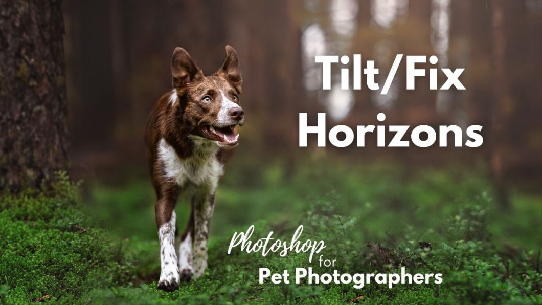
Tilt/Fix Horizons

We generally want  to make sure that our image is straight, especially when there are visible horizons, for example when at the beach or by water, where there is something that needs to be flat.

In Photoshop, we can tilt our photo in any direction. This may result in some of your image being cropped, unless you pair the tool with the Content Aware Crop tool (seen in a following lesson).

You can use the gridlines to line up horizons or even tree-trunks so they are straight.

Press  on your keyboard, or go to the crop tool. Click and hold a corner that you want to drag, then drag your pointer up or down to rotate/tilt the image.