Open to access this content
Archivesnext level
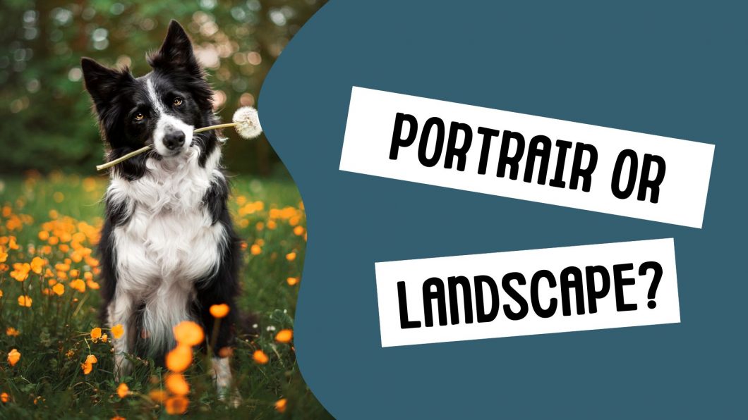
Portrait or Landscape Orientation
Open to access this content
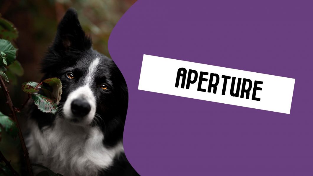
Aperture
Open to access this content
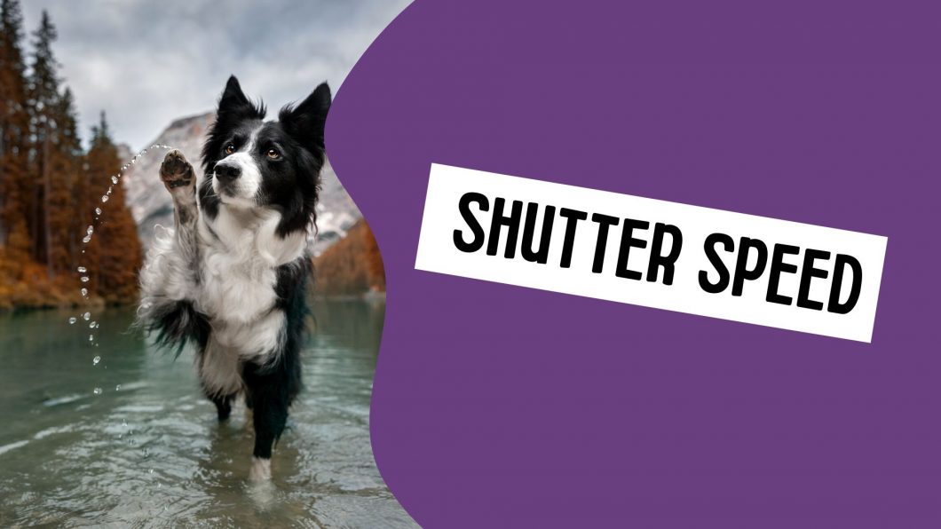
Shutter Speed
Open to access this content
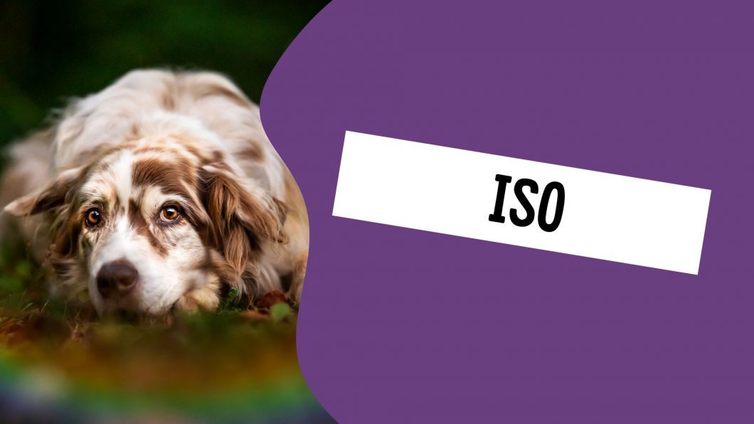
ISO
Open to access this content
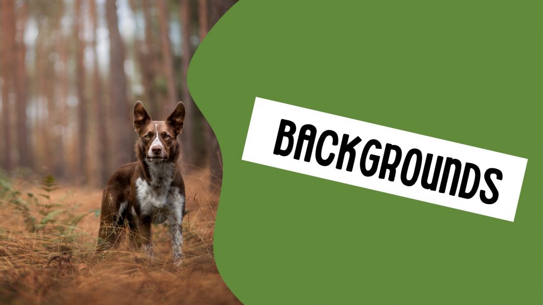
Backgrounds
Open to access this content
Self Evaluation & Elements of Style
Open to access this content
Finding Your Style
Open to access this content
Photography Goal
Open to access this content
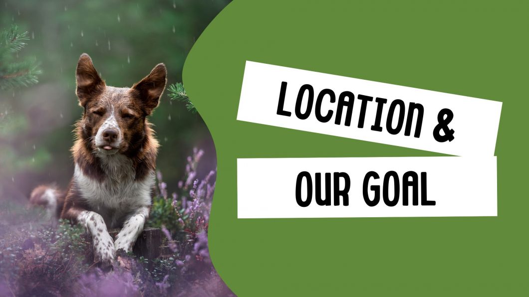
Location & Our Photography Goal
Open to access this content