
Your Result:
Your dog and their background are telling a harmonious story. Maybe a little too harmonious.
Actually, matching your dog’s colours to their environment isn’t wrong… it can make a photo feel really cohesive and intentional. Warm brown dog in golden autumn leaves. Cream dog in snowy fields. There’s a reason those work.
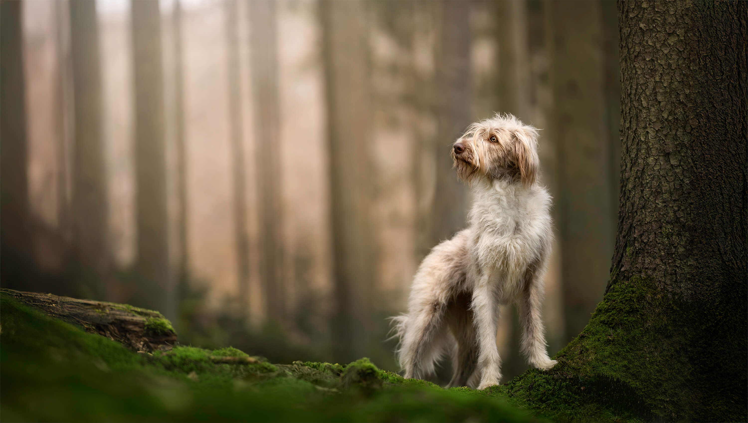
The challenge is that when colours harmonise, you lose one of the main ways a subject naturally stands out. So you need other contrasts to do that work instead.
Is your dog brighter or darker than the background? Is the background soft and blurry while your dog is sharp? Is there a difference in texture between them? These are the contrasts that can make a colour-matched dog pop, even when the palette is intentionally similar.
Above: A dog with a similar colour to the background. Can you see other elements that help him “pop”?
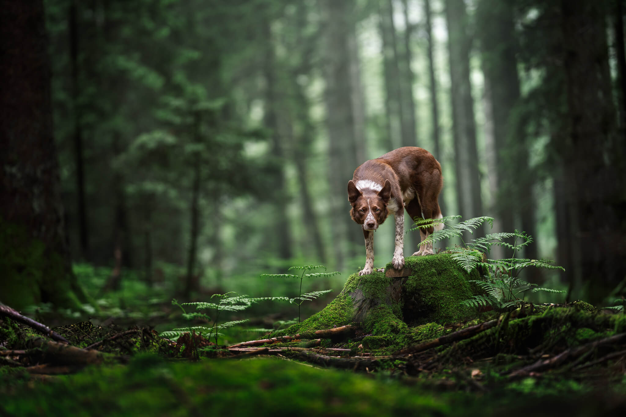
Red dog on green background = contrasting colours
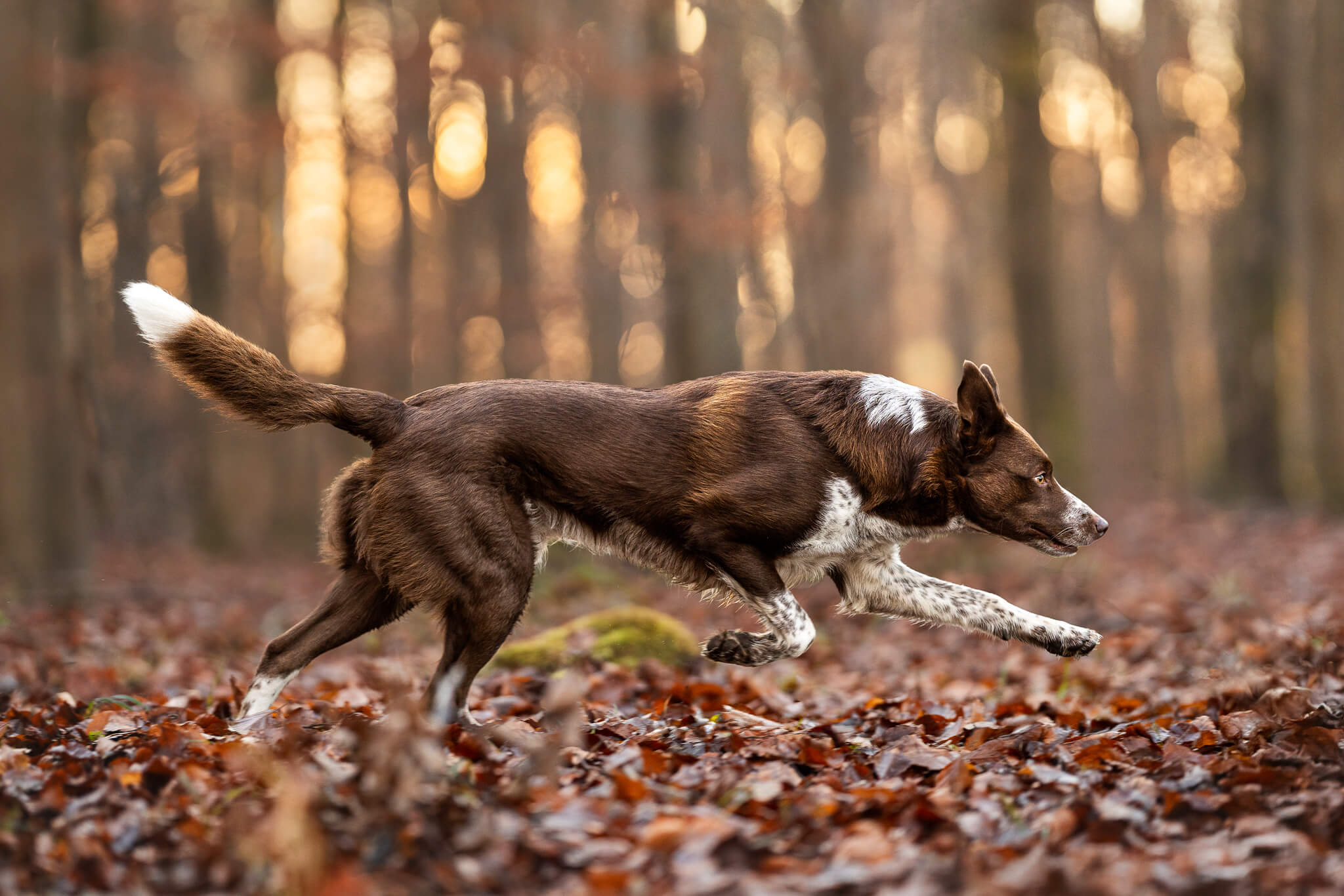
Red dog on warm background = similar colour palette… but not exactly the same. Plus, a number of other contrasts to help him stand out!
One thing to try:
Next time you’re shooting, ask yourself: if I removed the colour from this photo entirely, would my dog still stand out? If the answer is no, look for a slightly different angle or background that creates more light/dark separation. Or, in editing, play with contrasts. If your dog is naturally low-contrast – what can you do to the background to make it stand out more?
Want to go deeper?
Making your dog stand out, through light, contrast, and intentional editing, is exactly what the Make Your Dog Pop workshop covers. It’s €35 and gets straight to the point.