Archiveslearning journey

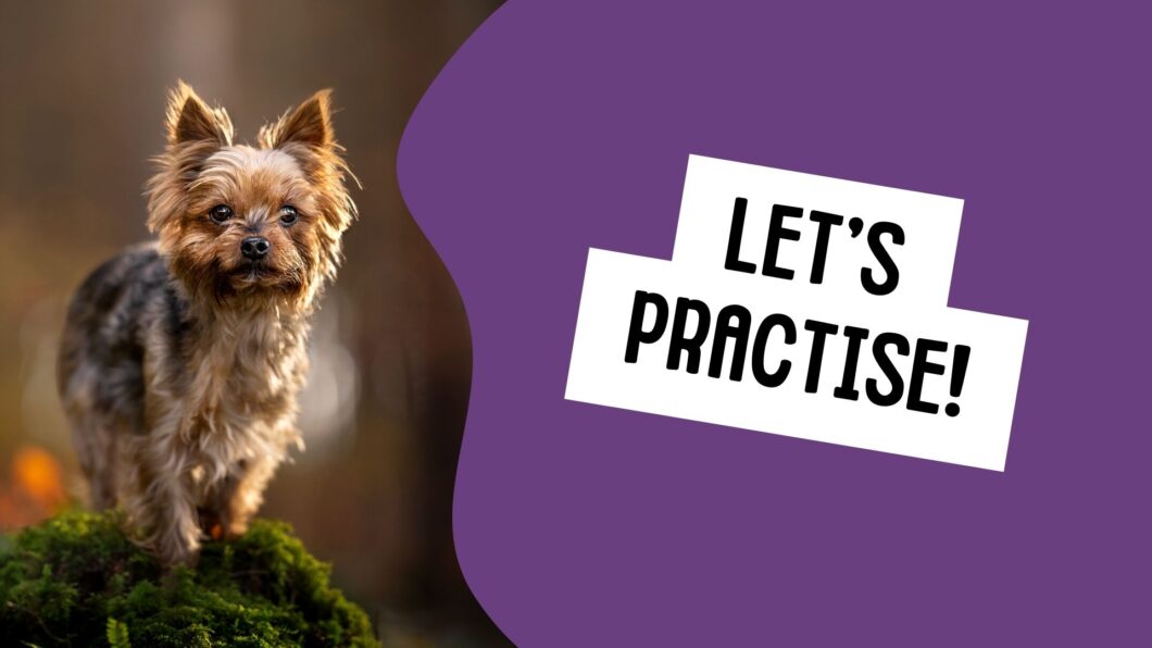
Let’s Practise!

Let’s work with some scenarios! The idea is that these will help you decide which settings to change and why, based on what your photo needs at the time, and the exposure you’re currently working with. For this example, we’re not worrying about the histogram or underexposing. We’ll get to that in following topics!

Remember my order from lesson 1? Here it is again.

If the photo is too dark, check your settings in this order: aperture, shutter speed, ISO. Since my aperture rarely changes, I usually only need to check and/or change shutter speed and ISO

If the photo is too bright, check/change your settings in this order: ISO, shutter speed, aperture (backwards of the order above.) 

I promise that eventually this becomes second nature, but if it helps you to have an order to work through, then use it!

Scenario 1.

You arrive at the woods on a grey, overcast day. You find your location – a pretty stump with some moss – and turn on your camera.

The settings are 1/500 sec, f/1.8, ISO 400, with your 85mm f/1.8 lens.

The photo looks like this:

You only have a couple of options here. Let’s work out which one/s make most sense. The photo is too dark, so we’re going to go aperture > shutter speed > ISO

Aperture: is already at its widest, f/1.8. Changing this setting right now will only let LESS light in. 

Shutter speed: Currently 1/500 sec. You could easily make this slower, allowing more time for light to come in to the camera.

How slow? That depends on where your limit is. For me, I don’t go slower than 1/400 sec. Otherwise I start noticing much more motion blur.

I would change this to 1/400 before touching the ISO. Why? it means our ISO will be as low as possible for this situation, because we’re already letting in as much light as possible with our other settings.

Remember, a smaller number (1/400, 1/320, 1/200..). mean the sensor is gathering light for a longer amount of time. 

ISO: Currently at 400. Assuming we’ve slowed the shutter to where we feel is our limit, and the image still isn’t bright enough, now we can raise the ISO. How much can you raise it? This really depends on your camera!

Here’s how this photo would turn out (approx) at 1/400 sec, f/1.8, ISO 1000

It could probably stand to be even a little bit lighter than this!

Scenario 2

You continue through the woods and find a huge, open clearing. You set your dog up at the edge of the woods and turn on your camera.

You have the same settings as before: 1/400 sec, f/1.8, ISO 1000

The photo looks like this:

 Let’s work out which setting/s make most sense to change. The photo is too bright, so we’re going to go ISO > shutter speed > aperture

ISO: Currently at 1000! There’s definitely room to move here! I would begin by dropping my ISO. If it got to 100 and the photo was still too bright, THEN I would return to shutter speed.

Shutter speed: Currently at 1/400 sec. We COULD make this faster (if we hadn’t changed the ISO first). That would definitely let in less light. BUT… we also have a reasonably high ISO.

Does it make sense to start with shutter speed in this situation? Probably not! We want to get our ISO as low as possible in this situation. If it’s still too bright, THEN we can return to shutter speed.

Aperture: is at f/1.8, meaning it’s letting in the maximum amount of light. We COULD make it narrower, letting in less light. But is this the smartest choice when we still have a reasonably high ISO? It’ll give us more background and foreground details as well. We can always return to aperture if we get our ISO as low as it can go, and we max out our shutter speed as fast as it can go.

You can see that by starting with ISO here and getting it as low as possible, we actually only need to adjust one setting!

Here’s the photo at 1/400 sec, f/1.8, ISO 200

Scenario 3

Suddenly, the sun comes out!!

You have the same settings as before: 1/400 sec, f/1.8, ISO 200

The photo looks like this:

(you’ll have to imagine the sun shining. I don’t take photos in the sun!)

Beautiful.

 Let’s work out which setting/s make most sense to change. The photo is too bright, so again, we’re going to go ISO > shutter speed > aperture

ISO: Currently at ISO 200. We can drop this immediately down to ISO 100. If your camera has an “extended” ISO option of like 80, or 64, I don’t recommend them. They’re unlikely to be better quality than ISO 100. It’s better to change some other settings.

Since the photo is still too bright at ISO 100, we need to move on to…

Shutter speed: Currently at 1/400 sec. Since our ISO is already low, there’s no harm in speeding up the shutter to reduce the amount of time light can get to the sensor. 

In this case, by the time we reached 1/640, the photo would be looking pretty correctly exposed. 

Aperture: is at f/1.8, meaning it’s letting in the maximum amount of light. We COULD make it narrower, letting in less light, if we hadn’t already changed the other settings. Of course, we’d then get more detail in the surroundings and that mightn’t be what we want. 


Here’s the photo at 1/640 sec, f/1.8, ISO 100

Scenario 4

Since it’s sunny, you decide to do some action photos, woo hoo!

You have the same settings as before: 1/640 sec, f/1.8, ISO 100

But… by the time you get set up and find a good spot for the action, the sun has gone away. You still want to give it a try. 

The photo currently looks like this:

 Let’s work out which setting/s make most sense to change. The photo is too dark, but we also need to remember we want to do action photos this time! Therefore, we have to make sure we have an appropriate shutter speed first, and then follow the normal order (aperture > ISO): 

Shutter speed: Currently at 1/640. We know we need this faster in order to do action photos. At least to 1/1250 sec. 

The photo now looks like this:

Oh boy.

Aperture: is at f/1.8, meaning it’s already letting in the maximum amount of light. Nothing we change here can help us. 

ISO: Currently at ISO 100.

This is promising! We should have a lot of room to move here. 

In the end, we would end up at about ISO 2000 to get our photo correctly exposed in this case (more or less. I’m working with some exposure calculators and figuring out stops here and math has NEVER been my strong suit 😂 the main thing to take away from this, is that we needed to adjust the shutter speed first because of the context, not because of the light)

Here’s the photo at 1/1250 sec, f/1.8, ISO 2000

(in reality it was 1/1250, f/1.8, ISO 500 but I’m adjusting settings based on the scenarios and lighting I’ve created, how much I darkened the image, etc.)

If you like these scenarios and find them helpful, please let me know in the comments and I’ll make more!

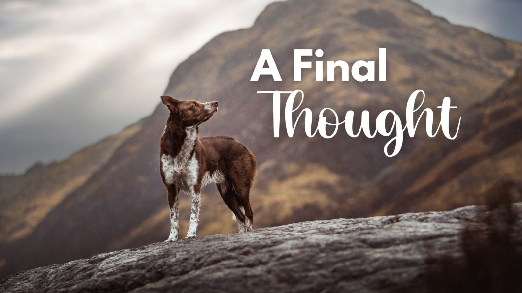
A Final Thought

There are two things I want to touch on briefly, to “set the tone” for the rest of your learning as you move off into the different stages.

Everything within the lessons you’re about to engage with are a GUIDE. There is very little here that should be taken as hard and fast RULES. 

If we say: “it’s best not to take photos in harsh sunshine”, but you hiked to the top of the mountain at midday…. JUST TAKE THE PHOTO. If we say: “choose a location with something beautiful or interesting,” but you’re photographing a senior dog in their yard and all you have is a wood fence for the background…

JUST TAKE THE PHOTO.

It will always be better to have the photo than to take nothing at all.

Working with where you live

One of the very few “urban” photos I’ve ever done

Throughout the lessons, you are going to see me talk a lot about forests and bokeh, about closed backgrounds and shaping the light. These lessons are strongly build on the kinds of photography that I create, and the content is therefore highly reflective of that. After all, you wouldn’t be here if you wanted to learn studio photography, or urban photography, right? 

That being said… I live in a specific part of the world. And while I travel, I always find myself back amongst nature, in the forests, by the mountains. I don’t tend to venture into deserts or fields, or into towns and cities – either because I don’t have access to those places, or they don’t inspire me.

That being said… please, please, please, don’t feel like photos in the woods are the only kinds of worthwhile photos.

Don’t go out of your way to find a tiny patch of woods if you live in a desert area.

Don’t put pressure on yourself to have closed backgrounds if all you have around you are huge open fields

While these are not my favourite locations and don’t necessarily fit with the style I’ve created, that doesn’t mean you can’t take beautiful photos there.

Many of the concepts around composition, camera settings, lighting, editing, and yes, even location, can still be applied to fields, deserts, beaches and other open spaces  – you just may need to be more creative about how you photograph in those locations. But trust me… they will have their own beauty. You have to show it to us!

Everyone always wants what they don’t have. A person in Australia may be lamenting the fact that they don’t have the thick tree coverage of Europe, while standing in a completely alien, and strikingly beautiful red-dirt landscape that’s nothing like we see over here. A person on the plains of Canada may be wishing for the sparkly bokeh of a pine forest, while behind them the sunset clouds turn the sky unbelievable shades of cotton-candy pinks and blues. 

Your location and place in the world invites you to tell your own unique stories. If we all took photos in the sparkly woods, we would all be taking the same photos. And that would be a little bit boring, don’t you think? Try and find ways to embrace, showcase, and share the beauty of where you live. 

(and for those of you in more urban spaces, I’m sorry that I won’t be able to help you much with that. I’d like to find a guest speaker on the topic but it’s really not my style and not something you would have seen on my social media!)

If I lived near this beach you’d best believe I’d be doing a ton of beach shoots.

Creativity and Critical Thinking

All this leads in to my second point.

You have a LOT of content ahead. So many lessons, videos, examples, downloads, tutorials… I have tried to fill every hole, to cover every question.. but it is simply impossible (and unnecessary) for me to provide information on every conceivable photography situation you may come across.

A good example is this:

I recently had some people asking me for water action photos. 

To which I wondered: … Wouldn’t this answer simply be: “Check out the lessons on action photos, then apply the concepts to photographing in water?”

Perhaps it’s my problem-solving brain, but I feel that many questions I’m asked, or many lessons I’m asked to create already have a very similar lesson in existence. 

“How about a lesson on how to edit a white/black/grey/brown dog?”

To which I think, I would surely use the same process as I would in editing any other dog.

“How about lessons on beach photography?”

Surely that would be similar to landscape photography, given they’re both in larger open spaces, with open skies and not much foreground.

You could argue that yes, they may be similar, but what if you need to do some things differently? What if you need different settings for water action photography, or beach photography? What if you need to do something differently?

Well, for one thing, then there probably WOULD be a separate lesson on it, if the differences were so great that I couldn’t trust you to use your existing knowledge and resources to work it out…

And for the other thing… EVERY photoshoot we do requires us to do something differently. To tweak and adjust to different elements of the situation. To look at what editing tools I have in my toolbox and consider critically and creatively how I could use them to solve the problem in front of me. To check if there’s anything similar but different in the massive library of resources at your disposal. For example, if you want to remove a tree stump from a photo, but there’s only lessons on how to remove a handler. One could assume similar techniques could be used. 

So as you make your way through all these lessons and resources, don’t lock information into a box. 

Be flexible in your approach and creativity.

Treat the information ahead of you like recipes. You can take bits and pieces of what you need for each photoshoot and tweak it, adjust it, shape it to suit the situation in front of you.

To that end, I don’t want you to use the information in the lessons ahead of you as gospel, as hard and fast rules. That you MUST edit in this way, or take photos with the dog looking to the side, or be in the woods, or use backlight. Just because I enjoy doing things a certain way, doesn’t mean you have to do them that way too.

I try, as often as possible, to explain my rationale for why I want you to do things in a certain way. Give the dog space to look into because the photo will feel more comfortable. Remove colour casts so there’s less distractions. Filter backlight so it’s pretty and sparkly and doesn’t have big bright blobs of sky…. but if you don’t like that advice, if the situation calls for something different, or if you just can’t or don’t want to do it like that for some reason…

THAT’S OK. 

I will try my best to teach you how I do things… it’s up to do to decide how much of that you take and implement in your own craft, and how much you leave aside. It would be really boring if you ended up a perfect clone of me and my style, after all. 

There are often no “right” answers. There are no “right” locations. There is no way to say “yes, this is exactly when you stop editing. The photo is perfect. You’re finished.” There is no formula for composition. This is an art, not mathematics. So while I can teach you guidelines and processes, I cannot solve every problem or give you a definite answer – that is where you, the artist, are in control and must use what you’ve learned and what you love, and what makes you happy, to create what brings you joy. 

Find what makes your heart sing, and create it. Then you can surely not go wrong.  

This is one of my most asked-for photos to turn into an editing tutorial, which I’m planning to do… but the truth is, with the tools and techniques used in every single one of my editing tutorials available to Learning Journey members already, they could probably manage this edit without a tutorial… as long as they went strong on a few “colour balance” layers – something we don’t normally do. Everything else is covered by either the tools we use, or the rationale I am always talking about. The point is… You CAN use the tools and techniques you already have or will learn throughout the lessons, to do almost anything. You just have to think creatively about how to use those tools to get the effects you want.

Credit where credit’s due

None of us learn in a bubble. That’s why you’re here, after all!

I wanted to take a moment to acknowledge a few of the teachers who helped me on my way – as I hope you’ll all do the same when you’re famous, award-winning photographers.

Many of my foundation skills came from Charlotte Reeves of Unleashed Education, and Nicole Begley of Hair of the Dog. Later, Haron Haghuis helped me find my way with storytelling and editing, and of course while I’ve adapted, shaped, and made many of these ideas and concepts my own, he was the first to introduce me to them.

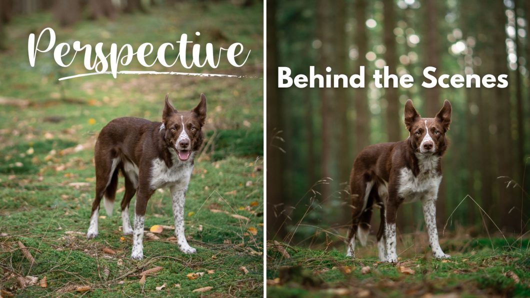
Behind the Scenes! Getting Low Comparisons!

Recently while out shooting, I decided to create a lot more examples for this lesson, since it seems to me that no matter how much I say to get down low, people don’t understand how low I really mean.

What I did on this walk, therefore, was to take three photos at each location:

  • standing up
  • kneeling down taking the photo at “eye level”
  • and having my camera at its normal height off the ground, which you will see in the video.

Of course in some examples, there isn’t TOO much difference between kneeling and being right on the floor…. but for me, the floor version always has more depth and more presence.

In these examples, I was mostly using my 85mm lens, or 135mm lens,  but I would have been close to the ground with any lens!

I’ve tried to edit them more or less the same so nobody can claim there’s any trickery going on with making one look better than another through editing! All are just extremely quick edits in Lightroom. You just have to ignore Journey’s expressions in the “up high” ones. He is sensitive to pressure and if I keep asking him for attention, it doesn’t work. So better to save asking for his attention for the “good” photos.

Standing

Kneeling/”Eye Level”

Down Low

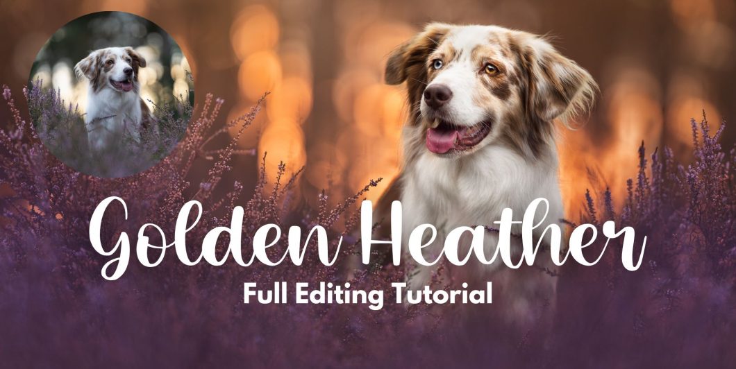
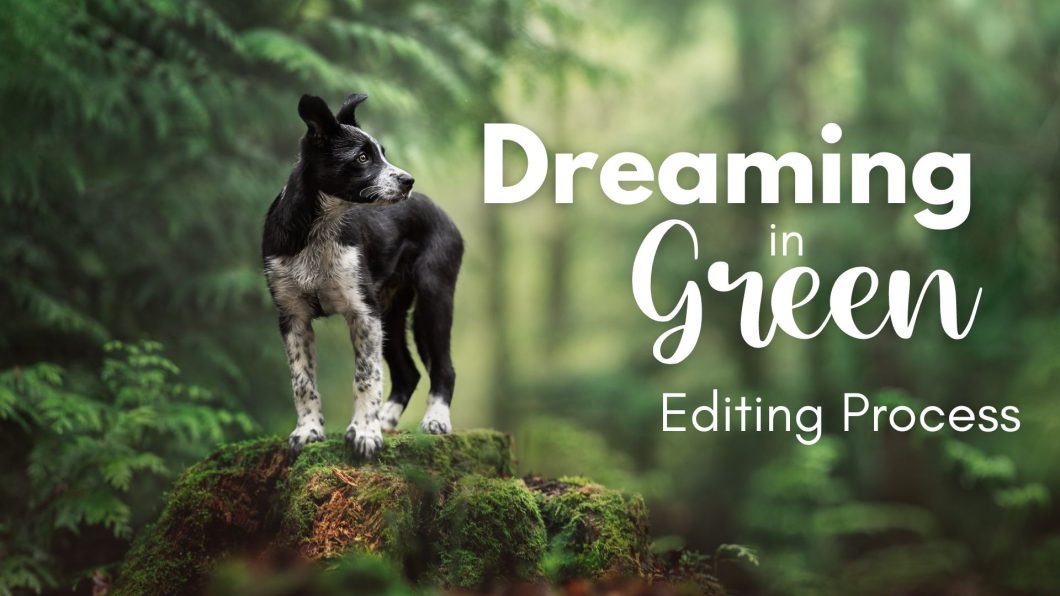
Dreaming in Green: Editing Process

Below, I break down each step layer used to construct the Puppy in Green image… BUT… I want you to remember that simply copy and pasting MY settings onto your image will likely not help you learn.

Instead, follow the structure and reasoning behind each step, but make your own decisions about how dark, how light, how cyan, how desaturated you want your image to be.

Only this way can you learn what works, how much is too much, what you like, and how to experiment with using the tools yourself. 

As I explained in the video, there are two ways to go about this edit, depending on if you use Lightroom and Photoshop, or just camera raw & Photoshop. You may have a completely different system and program, but since you signed up for my editing tutorial, I’m going to show you how I would approach the editing process using Smart Objects and adjustment layers. If you don’t like using smart objects the way I do, or you don’t want to use adjustment layers, that’s also fine – you do you, but then obviously your process might be completely different to the one listed below.

Similarly, there are many processes you could use to make your panorama. In the case of this image, it works perfectly in Lightroom, so that would be my preference here. If Lightroom does something weird or doesn’t work, then Photoshop is also an option.

Bonus!

Making a Panorama in LR:

  1. Select your images in the camera strip. Hold shift & click if they’re all in a line, or hold cmd/ctrl and click each to choose them individually. 
  2. Right click. Choose Photo Merge > Panorama
  3. Check that it’s chosen the right version of your subject (it doesn’t always). 
  4. Alter the projection if needed. Be careful that your subject isn’t warped. 
  5. Click “Merge”
  6. Wait for it to create a new Pano.dng file and work on that.

If you’re making a panorama in Photoshop but work in Lightroom first, do your LR adjustments NOW, and then we’ll make it into a panorama in PS. 

If you ONLY work in PS, you can skip this LR section unless you want to use Camera Raw on each individual image.

Lightroom: Global Adjustments

  • Fix the white balance
    • try turning the saturation and vibrance all the way up to see the colour’s in Hijinx’s coat, then adjust until it is a “nothing colour.”
    • or, use the eye-dropper tool on his white stripe. 
    • in this case, the photo was a bit too cool and waaayyyy to magenta.
  • Alter the highlights, shadows, whites and blacks.
    • Ask: does my image need this? Is it helping my subject stand out? is it making the background more or less distracting? Will I have to edit over the top of my edits later?
    • you can alter the HSL here if you want – though I usually don’t. 
  • Selective edits/masks
    • Bring clarity and texture to the face
    • raise whites on the face WHEN NEEDED (absolutely not needed in this photo). 
    • work on the eyes:
      • raise clarity and whites on the whole eye
      • brighten and desaturate the catchlight
      • make sure the pupil is dark
      • add colour to the iris if needed
    • lower highlight spots
    • remove colour casts by desaturating or using the opposite colour on chin, chest, neck, cheeks, etc as needed
    • brighten any especially dark areas as needed
  • Choose your panorama, right click, select Edit in… > Open as Smart Object in Photoshop.

Photoshop: If you didn't make your panorama in LR

  • Bring all your image layers into Photoshop, in one workspace.
  • Use the crop tool to extend the canvas.
  • Lower the opacity of all the layers except the main one, so you can see where they overlap.
  • Use the move tool to align them. 
  • Turn the opacity back to 100%
  • If you’re NOT working with Smart Objects, you may also be able to select all the layers, and choose Edit > Auto Align Layers, for Photoshop to align the layers for you.

Photoshop: Initial steps

  • Make a safe version of your image by right-clicking and choosing “New Smart Object via Copy”.
  • Make a new blank layer to do any clone stamp, healing spot brush and other retouching. Later in the tutorial I cloned over the dark tree trunk in the top right corner. You could do that now. 
  • This would be when I would run any High Pass filter actions too.

Photoshop: Shape the Light

Again, adjust these steps and layers to suit your individual photo. You don’t have to copy it exactly. Some photos need more, some need less. Check out the Editing Process Workbook (downloadable above) for some tips and tricks on Shaping the Light. 

  • One curves layer darkening most of the image, blacks pulled slightly up.
  • One curves layer to darken some of the bright areas
  • One curves layer darkening the outside edges as an open vignette. Curve pulled down, blacks pulled slightly up.
  • One curves layer darkening bright parts of the foreground
  • One curves layer with the curve pulled up, anchored near the centre line at the shadows end, as a spotlight. Masked out as needed
  • One curves layer darkening bright areas in the foreground
  • One curves layer darkening some of the branches in the background
  • One curves layer pulling black and contrast out of the trunk to the right
  • One levels layer adding some contrast.
If you wanted these greens to be even richer and deeper than they ended up – especially in that pale background area, you would need 1-2 more curves layers darkening those areas, like I had on the stump and in the foreground. 

Photoshop: Colours & Effects

  • Selective colour layer. Adjusting yellows: Add Cyan, slightly lower yellow. Adjusting greens: Add some cyan.
  • Selective colour layer. Adjust yellows: add cyan, lower yellows. Mask in on parts of the stump and trees on the right of the photo.
  • Selective colour layer. Adjust yellows: lower cyan quite significantly. Mask in on the dead leaves along the bottom of the photo.
  • Hue/saturation layer. Adjusting greens to yellows: Lower saturation by about -20
  • Hue/saturation layer. Adjusting reds. Lower saturation by about -20, and hue by -3. Mask in on the dead leaves along the bottom of the image.
  • Hue/saturation layer. Desaturate globally by about -30. Mask in on colour casts on the subject, and any other areas that are too strongly coloured.
  • Pale green gradient fill layer. Radial. 120% scale. 20% opacity. Moved to the top, and to the right of centre. Mask out the dog
  • Pale green gradient fill layer. Radial. 150% scale. Move directly overhead. Opacity 20%. Mask out the dog and anywhere that has gotten too bright.
  • Gradient fill layer, deep red/brown colour. Linear. 70% opacity. Mask out bits and pieces so it looks like ferns.
  • (optional) colour fill layer in a deep green tone. Masked in over the tree trunk on the right (which we removed earlier). Colour blend mode. 20-30% opacity. 

Photoshop: Finishing touches

  • 1 curves layer using “linear contrast” preset, to add a small amount of contrast. 
  • Curves layer for “Dodge”, pulling up on the curve to lighten. Mask in anywhere that is a natural highlight on the face or body. Look at dog skulls for reference. 
  • Curves layer for “burn”, pulling down on the curve to darken. Mask in anywhere that is a natural shadow on the face and body.
  • Save the photo. In Lightroom (if you’re using LR) check: does it need a touch more exposure or contrast? Add it if necessary. 

AI & Image Editing, Management & Creation

Photoshop Beta introduces exciting capabilities for AI-driven image creation and editing. With its advanced AI features, Photoshop Beta empowers users to create stunning composites, change backgrounds, and manipulate various elements of an image with ease.

The AI-powered Select Subject tool intelligently identifies subjects in an image, making it simpler to isolate and manipulate specific elements. Additionally, the Neural Filters feature offers a range of AI-driven filters and effects to enhance images, such as depth-aware upscaling, style transfer, and facial retouching.


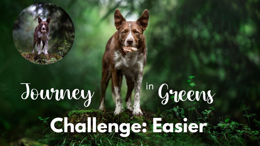
Deep Greens: Easier

DSC01492 DSC01492-Edit-2

This photo is slightly more challenging in SOME ways, but easier in others. You WILL need to know how to mask two images together in Photoshop… but if you’re using ANY of my Photoshop techniques, you should already be familiar with masking. There are other green-focused Lightroom only tutorials if you would rather tackle this in Lightroom. That would also work perfectly well.

Again, remember, you don’t HAVE to do all the steps listed below. You don’t have to edit the photo the way I did. You don’t have to do the same layers, with the same settings. In some cases, I’ve provided you with the exact settings I used… but also feel more than free to make this edit your own. Take what you want from the process below, and leave the rest.

What I loved about this photo was this real curving tunnel wrapping around Journey in the background, with the light area directly behind him – something we see so often Photoshopped in behind the dog. 

Of course, he is too funny with his leaf, but we’re going to ignore it and make it a nice deep green photo. 

We want a little bit more space under him, to give him some more presence on the stump, and make better use of rule of thirds by placing his eye on the thirds line.

How to Do it

Lightroom/Camera Raw/Whatever

  1. Adjust the white balance. Journey was very cool and EXTREMELY magenta SOOC. Remember, he’s much more of a brick colour, not pink.
  2. Overall exposure up a bit. The photo is rather dark and we don’t have a lot of highlights to worry about.
  3. Highlights down a bit, shadows up a fair amount (I had -40 highlights, +60 shadows). I especially want to get some light in that black-hole in the top-right of the photo. It’s EXTREMELY dark and unbalanced.
  4. Selective edits
    1. Clarity and texture over the eye area
    2. Brighten the eyes by raising whites
    3. Brighten the face by raising whites either side of his stripe
    4. Brighten catchlights by raising whites and shadows
    5. Remove colour cast on chest by desaturating and raising whites
    6. Lower highlights in the bokeh spots above his head
    7. Remove contrast & raise blacks in that dark area to the right
    8. Add yellow to nose as it was blue
Here’s how it looks after the selective edits in LR.

Photoshop: Setting Up the Image & Composition

Since we want some more space below him/a bit more foreground depth, we’re going to use a different photo of the location and mask it in.

This is somewhat optional as you could just crop the image so his eye is on the 3rds line and not worry about it. But I wanted some more depth from being down lower. 

I didn’t have any lower photos of Journey on the log, so we’re using a photo of Loki instead. 

  1. Open the image as Smart Object in Photoshop. 
  2. Open the Loki layer and get them into the same workspace. Put the Loki layer down the bottom and move it into position. Add a layer mask to the Journey layer. Use a black brush to merge the edges of the the two layers.
  3. Make either a smooshed layer (shift + cmd/ctrl + opt/alt + E) or a new blank layer and fill in the empty lower right hand corner that will likely be missing. Content aware fill will work perfectly with a smooshed layer, or you could use clone stamp.
  4. Make a new blank layer. Use the spot healing brush and clone stamp to tidy up some of the dead grasses and twigs.

Photoshop: Shaping Light

Ready for some curves layers?

  1. One curves layer to darken pretty much the whole image except bits of that dark branch to the right. Blacks pulled slightly up. Mask out the dog by hand.
  2. Open vignette. Curves layer to darken the two sides and lower part of the image. Brushed off that dark branch. Blacks pulled very slightly up, but not much.
  3. Curves layer very slightly pulling up blacks, anchored at the shadows area. Masked in only over that dark branch to pull some black/contrast out.
  4. Another curves layer, sort of another vignette but wider this time – mostly just darkening the lower part. Curve pulled down near shadows. Blacks left alone.
  5. Spotlight from directly above. Curve pulled up, anchored near shadows.
  6. Brightening curves layer just on his shoulder to brighten it (not sure why! Whoops)
  7. Levels layer to add contrast.

Photoshop: Colours

  1. Selective colour layer working on yellows. Add cyan by about +25. Mask out the dog with a proper mask.
  2. Selective colour layer working on yellows. Add cyan by about +30, lower yellow by about -10. Use on areas of background that have a slightly more yellow tinge to unify colours toward the cyan/green tone. This is very subtle.
  3. Hue saturation layer, working on greens with the slider extended into yellows. Desaturate by about -10, shift hue by about +2. Mask out the dog.
  4. Another hue/sat layer, again working on greens extending into yellows. Desaturate by about -30, shift hue by about +2. Mask in over areas of the lower part of the image that are quite fluorescent green.
  5. Gradient fill layer. Linear style. From the top, a very pale white/green, to the bottom, a very deep dark green. More toward the cyan side of the green spectrum rather than in the middle. Set to Soft Light blend mode. Opacity 20%. Mask out the dog. 
  6. Selective colour layer working on yellows, adding a TON of cyan (+85) and removing yellow (-20). Mask it in on the little fallen tree in the lower left corner that is likely very yellow.

Photoshop: Finishing Touches

  1. Two curves layers: one lightening, one darkening, for dodge and burn. If you’re in the Learning Journey, see Exploring > Exploring Editing > Face Contouring for more information.
  2. Colour balance layer, working on midtones, adding yellow (about -10 toward yellow), and magenta (about -2) on the shoulders and cheeks to offset some blue colour-casts from the light.
  3. Selective colour layer, working on yellows. Lower cyan by about -10… mask in over the leaf to give it a little extra colour.
  4. New blank layer, remove eye booger using spot healing brush (yes, I should have done this earlier, or put it right down the bottom of all my layers, but I got lazy)
  5. Another selective colour, lower cyans/add red by about -60. Mask in over the leaf. More red!
  6. Hue/saturation layer. Desaturate by about -40. Mask in places on cheek, chest and legs where you notice colour-casts.

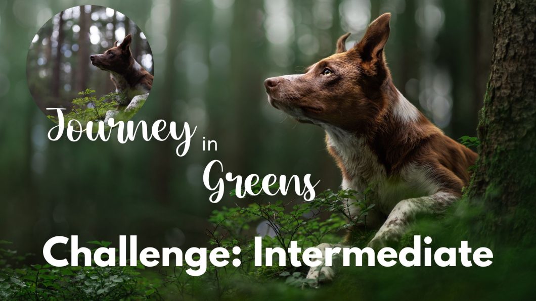
Deep Greens: Intermediate

DSC03803 DSC03803-Edit

The steps, & things to look out for

This photo was taken by the lovely Teresa Ullmann (@everfawkes) so if you want to share it on your socials, absolutely do, but make sure to tag both @inspawrationphotography and Teresa in the caption 🙂 There are SOME steps in the Photoshop section that may be a bit tricky if you’re new to the program, and you may find the “intermediate” photo easier, especially if you already know how to mask

Here was the editing process:

  1. White balance. Journey is very cool and quite magenta to begin with so you’ll want to correct that.
  2. Global adjustments: the normal things. Drop highlights a bit, pull up shadows a bit to get some more light on Journey’s face. 
  3. Selective edits (note, some of these required more than one radial filter):
    1. Drop highlights and clarity on those bokeh spots
    2. Brighten the face, ear, and cheek (pull up whites)
    3. Get rid of green/yellow colour casts on chin, chest and cheek
    4. Defringe radial filter on nose/snout to get rid of fringing/chromatic aberration
    5. Drop highlights on back shoulder
    6. Make nose less blue
    7. Clarity & whites on eye
    8. Brighten catchlight
    9. Brighten whole subject

This is how it looked when I was finished in Lightroom

Look, I labeled the masks just for you all. 

Into Photoshop!

There’s a few things here you can skip if you’re still finding your way around Photoshop.

Setting up the photo & fixing composition

  1. Make a new smart object copy of your original layer
  2. Use content aware crop to give him a bit more space below his paws. You’ll need another copy of the layer, and you’ll need to rasterise it to do Content Aware Crop. Fix any bits that Photoshop makes weird
  3.  I ended up copying that whole left side of the image, pasting it, and going to Edit > Transform > Flip horizontal, then masking it in over the top of that dark tree trunk. I wanted him to have open space to look into.
  4. When you’ve done all your composition fixing, make a smooshed layer (cmd/ctrl + opt/alt + shift + E), Go Filters > Convert for Smart Filters, then Filters > Blur > Motion Blur. Add some motion blur going straight up and down, 90 degrees. Whatever amount you like. I think mine was 300-400. Mask it in over the top and bottom edges of the bokeh spots to make them “melt”.

Shaping light

  1. One curves layer darkening pretty much all of the image except Journey. Blacks pulled slightly up.
  2. One curves layer darkening the two sides and lower part. Curve pulled down, blacks pulled up slightly.
  3. One curves layer acting as a spotlight shining down from above/top left. Curve pulled up, anchored near the shadows.
  4. One curves layer just darkening the right-hand edge and the lower part of the image.
As always, brush these masks on and off of areas that need them. 

Colour

As you can see above, we’re already halfway to getting our deep green tones just by darkening up the photo. I actually liked these red/brown trees in the back except that they cut right directly through the middle of the photo and felt distracting to me. If they’d been on the edge of the photo I probably would have left them. 

  1. Selective colour layer, adding a bit of cyan to yellows (not much!). Mask out Journey
  2. Selective colour layer adding a LOT of cyan to yellows, removing some yellow. Masked in where needed – mostly left side of the photo
  3. Hue/saturation layer working on yellows into greens. Desaturate a bit, and pull hue slider very very slightly toward blue.
  4. Whoops a mystery levels layer. Add contrast.
  5. Selective colour working on greens. Add magenta. This will desaturate them.  

Special/fancy stuff to finish

  1. Gradient layer. Linear style. Angled from top left to bottom right. Top left white, moving down to deep green in bottom right corner. Make 100% opacity across the whole gradient. Set to Soft Light blend mode. Mask out Journey. Opacity 40%. 
  2. Hue saturation layer, desaturating globally. Mask in chin/chest.
  3. Gradient layer. Soft pale green/white in Radial style. In mid/top left corner. 20% opacity. Mask out Journey.
  4. Dodge & Burn Curves layers. One darkening, one lightening. 

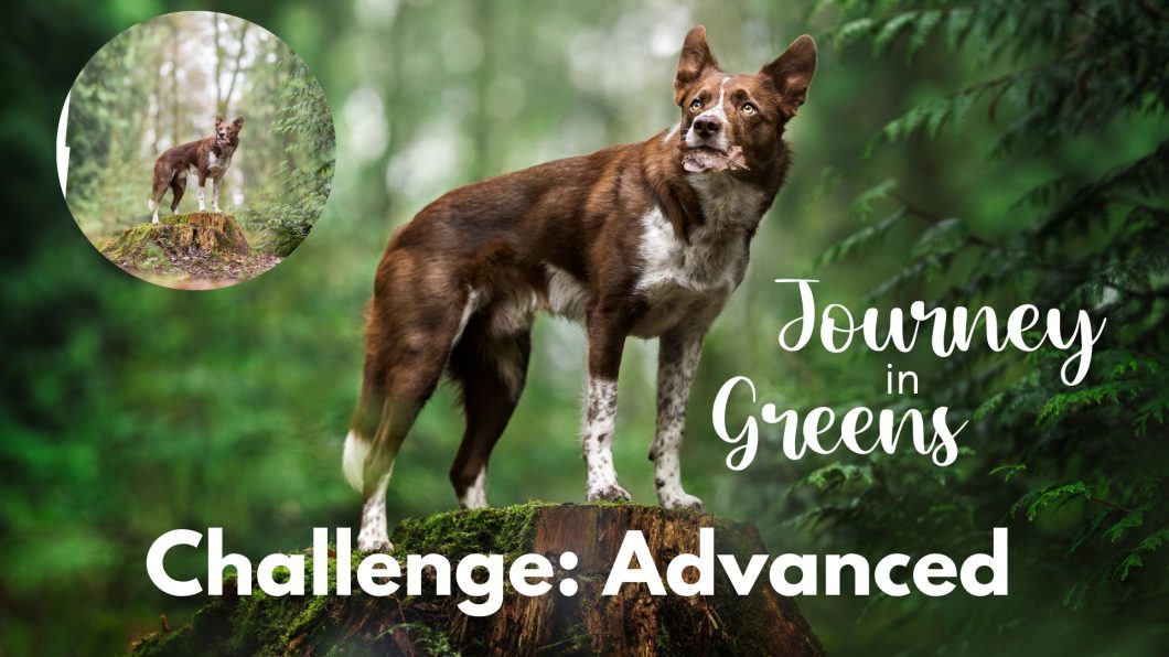
Deep Greens: Advanced

DSC01392-Pano DSC01406-Edit

I knew as soon as I saw this location that it would be something special. With those trees framing either side, and the tunnel of light behind the dog, it was close to perfect (if perfect exists).

But… I wanted to change up a few things, if only to make my life difficult, but also because I know what I like.

So what was supposed to be a reasonably simple edit for anybody to have a go at became a massive undertaking, hence why the Deep Green Editing Challenge got split into three levels. It was all thanks to this photo.

So, get ready to flex your technical fingers, fire up your tablet, download the RAW files, and let’s get into it. 

Remember, you don’t HAVE to copy my edit, or my steps. As I said on the intro page though, I feel like some of the times I’ve learnt the most are when I’ve attempted to copy a certain technique or look.

So, before you start: have a look at the before/after. Is there anything about the edit you’re not sure you know how to do/you’re not sure how you’d do it? That should be where you focus your attention. The rest you could edit yourself in your own way, if you want!

Final note before we start: it’s possible that at some point throughout this process I jumped back into Camera Raw to my RAW file and LR edits.. (though not likely given all the extra layers). If I did it would have been to lower the exposure, or slightly change the WB.

How to do it

Get all your panorama parts. I merged mine in Lightroom as the very first step, but you could do it in Photoshop if you want. For me, LR did a good job so it was the least fiddly, lowest-effort option. I did the panorama BEFORE making any other edits, so that from the beginning I was just working on one single image file.

Reasonably few edits in LR since it was a pretty great photo to begin with in terms of exposure etc.

Adjust white balance. It needs more warmth and less magenta.

Drop highlights a bit.

Selective edits

  1. Increase texture & clarity on the face
  2. Lower highlights & exposure on his stripe
  3. Increase clarity on eyes
  4. Raise whites & lower saturation on catchlights
  5. Lower highlights, exposure and clarity on tunnel behind dog.

Photoshop: Fixing Composition & Things

Make a Smart Object via copy of your original layer. 

Let’s move those branches on the right closer to Journey so there isn’t such a dead space there.

Make another duplicate of the layer (this one can be a duplicate). OR just select the whole right hand side of the image & do a copy paste of it. Move it toward Journey so the edges of those branches have a small gap between him and them. Mask this layer in.

Either make another copy of your layer, or copy/paste the whole tunnel section, OR just make a new blank layer and use the clone stamp, to fix up the Y-shaped tree growing out of Journey’s head.

I made a duplicate layer, flipped horizontally, it and moved a section of the light tunnel over the Y-shaped tree and just masked it in. 

Crop it kind of more or less to size – having it bigger is probably better than having it smaller in case you want to change it later. But we want to know where the edges are so we can fill them in if needed (I had several little corners to fill)

I actually opened my “Green advanced side” image in PS to use to fill in the lower left corner but you could also do this with the clone stamp tool, or a content aware fill (you’ll need a rasterised image layer to use Content Aware Fill – see below for the next step). If you’re in the Learning Journey you can see my big layers process flowchart in Exploring > Exploring Editing)

My photo ended up a bit taller than the original, so I had to fix the top right corner. I made a “smooshed” layer with Cmd/Ctrl + alt/opt + shift + E and did content aware fill. 

One blank layer to finish filling in the Y-shaped tree, as I still had the top of it left over – my layer from earlier  didn’t cover the whole thing. I just used clone stamp to cover it up. You can also remove Journey’s little eye booger here.

I ran a high-pass filter action over the image to get Journey super sharp and crisp, opacity down to about 40%.


Photoshop: Shape Light & Add Fern

Two curves layer darkening pretty much the entire image (apart from Journey/Journey’s head/back)

One levels layer increasing contrast.

Now we add the ferns overlay. I got this overlay from Etsy. I don’t have the rights to sell or share them. You can find them here if you want to purchase them. I added the ferns AFTER the two darkening layers because I didn’t want them to also end up extremely dark and nothing but black blur. I wanted them to keep some of their green.

Another curves layer, darkening the sides and ground.

Another curves layer, darkening some bright/pale parts of the stump.

No spotlight! He is already light enough and the background is VERY light.

Photoshop: Colours

One selective colour layer working on yellows, increasing cyan.

A selective colour layer working on yellows. Pulling up Cyan to 100, removing some black. Masked in over the light tunnel behind Journey to take out the yellow tint.

A hue/sat layer working on greens extended into yellows. Desaturating a bit and shifting the hue slightly cooler.

Hue/sat layer working on yellows, extended toward oranges. Desaturating a bit and shifting the hue toward reds. Masked in over some weird yellowy-green bits of the stump.

Hue/sat layer desaturating globally. Masked in over colour casts on neck, chest, legs, chin. 

Hue/sat layer desaturating some colour from the moss on the stump.

Photoshop: Last Things

First, get the lasso tool. Make it a soft feather, ~ 300 px. Draw a kind of triangle, with the base of the triangle at the top of the stump and the top of the triangle outside the top of the image. Make a gradient fill layer. Soft pale green/white in colour. Reverse it so it’s coming from the top down. Pull it downwards if you want it to have more strength, or adjust the opacity slider. Adjust opacity. Put the layer inside a folder. Add a layer mask to the folder. Use a mask of the dog. 

One more vignette/lower edge darkening curves layer, which I also used as my burn layer.

Dodge layer  (curves, lightening).

Colour balance layer to add a bit of yellow to his nose.


Finally, add a little contrast in Lightroom before export, and you’re finished!

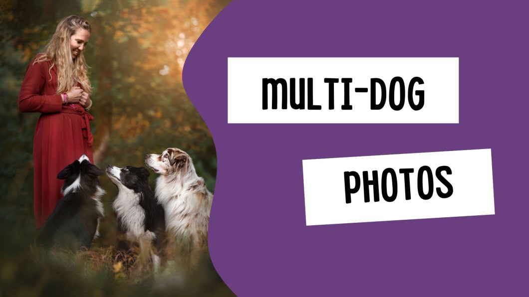
More Than One Dog / Dog & Owner Photos

Now that you’ve read through the depth of field lessons you may be thinking: Ok then, but what if we need to get more than one person/dog in focus?

Or, every time you try and photograph a dog and a person, only one of them is in focus. 

Of course, this all comes back to the plane of focus. 

In this lesson I’m going to use the term “group photo”. This could refer to a group of 2 or more dogs, or dog and owner, or multiple dogs and an owner… the concept is the same. 


Two methods for group photos

There are three ways to take in-focus photos of multiple subjects.

  1. Use a wide plane of focus so even if they aren’t in a perfect line, they’ll still all be in focus
  2. Make sure they’re in a perfect line
  3. Take multiple photos, focusing on each subject, and edit the photos together in Photoshop.

Obviously each on of these has their pros and cons, so let’s explore. 

Option 1: Change your plane of focus

In general, when we’re taking portrait photos, we want a soft, blurry background and narrow depth of field. This helps eliminate distractions, gives us background and foreground blur, and generally just suits the style more.

But of course, with a narrow depth of field you can run into trouble with multiple subjects. Let’s assume our plane of focus is only a few cm wide. If one subject is even just a little bit forward or back from where the camera centred its focus, that subject will be outside the plane of focus. So the nose may be in focus because it’s still inside that plane… but the eyes won’t be.

Below, I’ve created this scenario. The dashed yellow line is the centre of the plane of focus and will be the sharpest area of the photo. From there, it rapidly starts losing focus as it gets further or closer from that line.

You can see exactly this occurring in the photo below of Loki & Journey. Loki’s eyes and most of his nose are in focus… but only Journey’s nose is. Notice how he’s sitting slightly back from Loki. In this photo, I focused on Loki’s eye (because I use Option 3 to take group photos). 

If I had wanted both dogs to be in focus in this situation, without moving either of them, I would have a couple of options to do so:

  • Narrow my aperture. This was taken at f/1.8
  • Move further away from them
  • Possibly use a wider angle lens.

Can you see though, that each of these options comes with its own set of difficulties?

I think that in order to get both dogs in focus with my 135mm lens, even with them only being slightly apart, I would be looking at at least f/4, f/5.6, maybe f/7… maybe even narrower. The further out of line they are, the narrower I would need to make my aperture.

This of course means I would need to put my ISO up. The settings were: f/1.8, 1/400 sec, ISO 640. If I wanted to go to f/5.6, the settings would need to be: f/5.6, 1/400 sec, ISO 6400.

You can see this is a HUGE difference in settings, with potentially a large loss of image quality, more noise, less detail etc. It’s really only feasible on a bright, potentially sunny day. 

Add to that, you’re going to get a lot more detail in the background/near surroundings of your image too. 

You could mix these methods up – move further away from your dogs AND narrow the aperture… but this is also going to mean less pixels making up the image of the dog (less detail for the dog), and again, more of the background & near surroundings in focus.

If the two (or three or four) subjects are even further apart – like a dog sitting on a person’s lap, then the plane of focus is going to need to be even WIDER to get them both in focus. 

Option 2: Make sure they're in a perfect line

By lining your dogs/dog and subject up perfectly, you can use a narrow plane of focus and still have everything and everyone in focus.

Speaking from experience, this RARELY happens and is a very risky way to go about getting group photos. One of your subject could be 2cm too far back, and their eyes will be out of focus. Dogs move. People move. 

I think of all the group photos I’ve ever done, I can think of MAYBE 3 where I haven’t used option 3, but have simply lucked into having a photo with both dogs in focus straight out of camera.

Notice how Laura and Dusty are side-on to me. This is going to make it MUCH easier to get them both in focus, than if they are facing forward looking forward the camera.

I have so few examples of using this option that I honestly can’t find any more examples!

Option 3: Multiple Photos & Photoshop

The last method is definitely my preferred method.

Essentially, I take some photos of dog 1, and some photos of dog 2. I bring both photos into Photoshop, and perform a headswap. The technique is quite simple. If you’re in the Learning Journey, you can check out the lesson here. 

This technique requires some editing skill, but it means your two subjects can be out of line (within reason), and you can keep your aperture nice and wide for that soft, creamy background. 

Here are some examples where I’ve used this technique.

You can probably safely assume that in 99% of my multi-subject photos, I will have done a head (and/or body) swap. 

In the cast of the backlit photo of Loki and Journey on the stump, I think the final photo of Journey was a combination of 3-4 different images to get him looking how I wanted him to look. 

Conclusion

There’s no way to “Cheat” depth of field. It’s physics. You can actually find calculators online that will tell you how wide your depth of field will be depending on how far you are from your subject, and what aperture you’re shooting at. 

This one is excellent, as you can slide things around, adjust the settings, and see how it changes. Bring the model right up close and watch her nose go out of focus, then come back into focus as you move her backwards. Down the bottom you will see the “Depth of field” and how it goes from mere centimeters wide, to meters wide – of course being able to be affected further if you change your aperture.